This is a Beta version of trsearch.org, more info in What's New page. Did you found a problem? Please report to info@trsearch.org
Trinity
Interests: TRLE, Music, Art, Film, Languages
Birthday: 29 Mar 1990
Gender: f
Items
417
417
Reviews
485
485
Follower
0
0
Showing 1 to 15 of 485 reviews
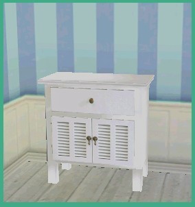
3 Louvre Table Set
by October
by October
I haven't seen any tables quite like this so I think it's quite usable. Especially since you have provided multiple color choices to fit your level style (I love it when people do that!). The meshes are perfect and the textures are nice. It has kind of a Sims object style to it which I like. Overall a good object to add to your level! :)
(15 Feb 2012 03:43)
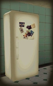
Vintage Fridge
by October
by October
This fridge has charm yo xP
This is adorable :) I really like it! It's great for home levels, the only time it wouldn't fit is if you're going for a modern kitchen. Other than that this would be a great addition to your home level. I think it's really unique and well done. My only one complaint is that it takes up 1 & 1/2 texture pages when it really doesn't need to. Otherwise it's wonderful! :D
(15 Feb 2012 03:37)
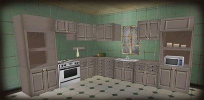
Vintage Kitchen
by October
by October
Great :D
So thankful to see new kitchen objects released for us to use! It is perfect for any house level. It can fit into both casual home levels and also the creepy style home levels because the kitchen objects have very neutral colors. There are a few different static objects, but the main counter is split into two pieces which can be both good or bad. Bad in the sense that you can't really customize where exactly the oven goes etc because it's already placed with the rest of the counter. But, at the same time it can be a good thing because it takes up less static object space in your WAD! The meshes are nice and the textures are lovely. Very good object, definitely recommend!
(15 Feb 2012 03:32)
Shauni's Birthday Object
by THOR2010
by THOR2010
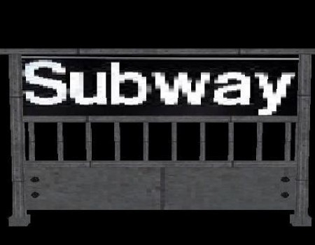
Oh it's perfect! :D I love this, thank you for making it! <3 *Originality: I think it's the first Subway sign here :D *Quality: I saw no flaws, of course hehe ^.^ *Usability: Perfect for any city level with a subwaaaaay! You could even use it in a city if you don't have a subway, and put different words on the sign. So extra usefulness there. *Textures: It fits the theme of the object just right and doesn't take up hardly any space in my WAD's texture set. *Meshes: It looks just like I imagined a subway sign in NY looks. Just right! It's about 3 blocks wide, which is a great size for putting near the steps down to the subway. :) AWESOME :D
(26 Apr 2011 02:09)
Various Castle Objects 1
by Mr XY
by Mr XY
pretty :)
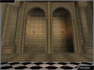
These are beautiful objects! Very nice and original styling. It reminds me a bit of something you would see from Prince of Persia. ;) The quality is perfect, no problems, no misplaced textures or holes. The meshes are detailed but capable to be put into the old TRLE if you want. The textures are so beautiful! I love the little details and the brick texture is very nice. I hope you release the matching level textures, as it might be hard to match the exact brick style. Overall, wonderful objects! I can see many people being able to use them. Thank you! :)
(13 Jan 2009 03:51)
TRA/TRL Fountain
by mike quahe
by mike quahe
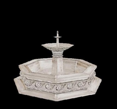
Originality: It's a remake of the TRL/TRA fountain style, so it's not completely original as far as concept goes. But for the TRLE we don't have anything quite this beautiful :) Quality: The quality is wonderful, just like with all your objects. I found no problems. Useablity: For any garden or outside of a mansion or the TR manor remake, this is perfect. It's only for TRNG or TREP though. Textures: The textures are from TRL or TRA, so they're not new but they are really good quality. I think a few areas could have been mirrored or possibly rotated slightly better. But it looks fantastic as it is :] Meshes: It's perfectly shaped and a good size. There is a lot of design work on this object! I just wanted to say that it's worth the effort because it looks beautiful :D
(04 Dec 2008 20:19)
Egypt Pack
by mike quahe
by mike quahe
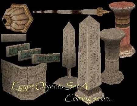
Original: There are a lot of Egypt objects from TR4, but these are really nice new custom Egyptian objects. There are not any that are this nice :) Quality: I saw no problems with any of the objects. There are no misplaced textures or mesh holes. Useable: This is perfect for your Egypt level, and other objects can be used in other types of levels. Like the swing pole or the rolling boulder. These objects are for both TRLE or NGLE. Textures: I love the textures, they looks so nice. I think the little details are really nice, like the symbols. Meshes: The obelisk is really cool and all the objects' meshes are fantastic! The trap is really cool, I'm really impressed with it! I really want to use it in my level (along with the swingpole), though I might have to retexture it since my level isn't Egyptian. I will definitely credit you if I use it! :) Love your objects!
(04 Dec 2008 20:03)

Jill Head Mesh
by laralives
by laralives
Originality: It's kind of hard to rate the originality when it's just one mesh. The style is fairly original, it looks like short hair from the front, and has a place for a ponytail in the back. However, not all the pieces of the mesh are new, the eyes at least are from Po Yu. ;) Useability: Everybody needs a head for their Lara! It may have been easier for beginners to add it in a DFX file instead of the meta file, but that's no biggie. I think anybody needing a head mesh could use this. :) Custom Meshes: It's pretty good. The hair is a little thin, but I like the style and how to goes over her eye a little bit. Makes her seems a bit mysterious. I did notice a bit of a dent on the right side of her head. I think it's supposed to look like the bangs are over her head, but if you compare it to the left side of her head you'll see it's not symmetrical. That's the only problem I saw. It' a very pretty head mesh! Good job :)
(02 Dec 2008 17:12)
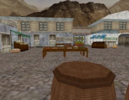
Market Place Set Part 1
by usuki_frenzist
by usuki_frenzist
(This is a review for both pack 1 and pack 2.) -Original: Well they were made before on another website, but for the TRLE these are original. -Quality: The meshes are perfect and the textures fit wonderfully on the objects. -Usability: Perfect for a city or village level! -Textures: The textures are really good! I was pleasantly surprised when I saw good quality of them all! The fruit, wood, fabric and everything looks wonderful! -Meshes: I think the owner of 3Dmodels.com just rips objects from video games, so I'm not sure if he's actually the one who made it. But whoever made it, it looks fantastic in game :) Some of these objects are exactly what I was looking for! They are all wonderful! I'll definitely be putting these beautiful objects to good use :)
(11 Nov 2008 18:18)
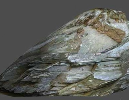
4 Rocks in high-res
by maikoon
by maikoon
Very impressed
Originality: I don't think there are any other large rocks on the TRLE. Quality: Just looking at this makes it so obvious how high the quality is! There are no flaws that I could see. Usability: Any outdoor level near mountains should have this object in it! I rated it a 9 however, because it can only go with certain types of mountain textures. The more grayish textures are a bit rarer than the more brownish ones. Textures: Textures are brilliant. They are extremely well detailed and perfectly rotated. Meshes: The meshes are great, they have good shape and look realistic. My favorite one is the one that's shown on the screenshot. Someone should turn this into a falling/rolling boulder, that would be cool. hehe. This object is amazing! I am really impressed with all of your objects!
(30 Sep 2008 08:35)
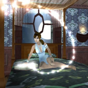
Midnight Fashion
by White Tiger
by White Tiger
Beautiful! <3
She is sooo beautiful, and the presentation of the screenshots are brillant! :D Originality: There are a few dress outfits for the TRLE, but none exactly like this. The shirt is very unique, and the flower belt. And there are three different versions, added to the originality. Quality: The quality of your outfits are always amazing! I never saw any flaws, no bad shadows or holes. She's a perfect little beauty :) Useabilty: I want to make a level just to use this outfit! hehe. I think she would look lovely in any city level, but she would look especially good in a home level. Meshes: Her face mesh is goregous, she could be a model :) The shirt you made is so unique and cool looking! The necklace she has is very well done and eally adds to the glamour look. I love the flower on her belt, it can be hard to make small flowers and I think you did a great job! The highheels are lovely, and the textures that go with it are equally as nice. Textures: Her face is amazing! You did great with her eyeshadow and eyebrows, I always have a hard time with that. Her skin textures on her legs look great, it really does make her legs look betteer with textures like that! There are so many pretty versions of this outfit, and each has equally beautiful textures! I love it! <3
(30 Sep 2008 06:40)
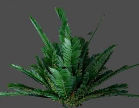
20 High-res Plants
by maikoon
by maikoon
Originality: Well for plants, I think these are original. These are very high quality, and some of the specific plants I don\'t think have been made for the TRLE yet. Just the way they look makes you want to use it in your level! Quality: I think these plants are some of the highest quality plants out there for the TRLE. When you look at them you can see how much work must have gone into it. Usability: I gave the usability a 9, I wanted to give it a 10 but there a two plants with too high vertices\'s to have in the old TRLE (all the others work tho). Not everyone uses the NGLE yet, so I thought I\'d mention it. And some of the pictures are very large, so it could possibly hinder someone who has a full WAD. But don\'t get me wrong, this object set is AMAZING! Textures: The textures are perfect! There are so many different plants to choose from, and every single one of them looks amazing. The textures are beautiful! Meshes: The plants meshes aren\'t completely 3D, they work in a more 2D fashion, letting the texture placement make the illusion of a 3D plant. You couldn\'t even tell in game, they look so great! The meshes match perfectly to the textures placed on it. It must have taken really long to match up the meshes with the textures, defenetley a 10! [i]Edit:[/i] For some reason I can\'t rate the meshes and textures (an error?), but they\'re worth 10s to me! ;) By far, an amazing object set that I think everyone should take a look at! :D [i]Edited by Trinity[/i]
(27 Sep 2008 19:10)
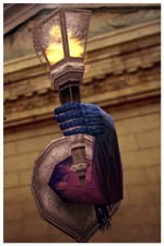
Lantern held by a creepy arm.
by Piega
by Piega
Original: I don't think I've ever seen a lantern quite this original, even in modern video games. It's got a lot of uniqueness about it. Quality: Of course it's perfect, Piega made it ^_^ Useable: I can see this in a haunted level, or sort of a fantasy type theme. I think this would look great in those kinds of levels. It adds a sense of danger and mystery to the room. Custom textures: Super cool, especially the arm and hand that's grabbing the light. Custom meshes: Very original and I saw no problems with it. I think it looks perfect and it's a good size. I like everything about it! This object is fantastic! :D
(01 Sep 2008 06:15)
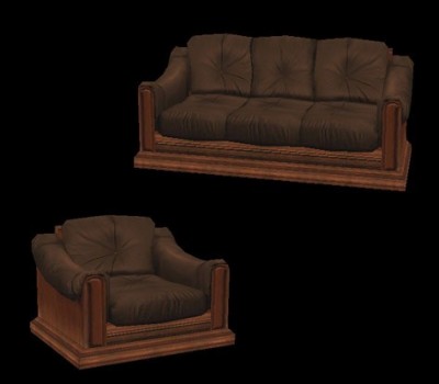
Tomb Raider Anniversary Sofas
by Trangel
by Trangel
Stolen Object, + Only for the TRNG
Originally: This can't be classified as original when it's the same thing as PeeT's manor couches. Quality: The quality is good, no holes or anything. But I don't know if that's your work or PeeT's. Usability: The couch has too many vertices's so it can only be used with TRNG. The chair, however, can be used in the TRLE. Meshes: In the read Me you said you made these, and that they are "inspired" by PeeT. Well I just compared the two and these are definitely PeeT's objects, just simply modified the arms of the chair and scooted the seat mesh. They even have the same amount of vertices's. I have a picture comparing the two: http://i13.photobucket.com/albums/a277/BlueMoonCafe/Stolen.jpg Textures: They're from TRA so I can't really count them. Why would you steal his object mesh and not credit him? That's just low.
(30 Aug 2008 19:36)
Only for TRNG
Originality: There aren't many 3d banisters in the TRLE world at the moment, and none quite like this. Quality: There are no errors or mesh holes or anything that I have seen on this object. Usability: It's got too many vertices's to be used in the TRLE. If you want to use them you'll need to use the TRNG. Also, there are only two object, sloping down and to the side. It's perfect for a staircase but if you want to use it in other directions you'll have to edit your own. Textures: They fit the object well and look very nice on it. And it takes up a very small texture space in your WAD, which is great. Meshes: The meshes are perfect, they look like very classy yet subtle enough banisters to go into any manor level.
(30 Aug 2008 19:17)
Showing 1 to 15 of 485 reviews
