
This is a Beta version of trsearch.org, more info in What's New page. Did you found a problem? Please report to info@trsearch.org
MrNiceGuy
Interests: None. Okay, a few. Alright, lots of them!
Gender: m
Items
23
23
Reviews
136
136
Follower
0
0
Showing 1 to 15 of 136 reviews
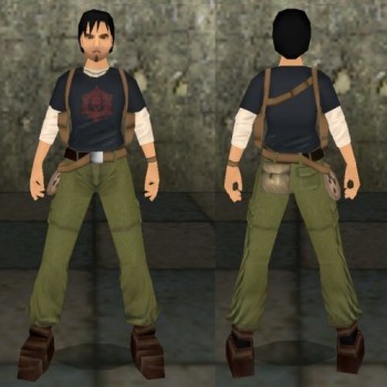
Tomb Raider VI Kurtis Outfit Remake
by Po Yu
by Po Yu
Kurtis at a climax!
This outfit really blew me away! There's no denying that immense work must've gone into making it, and seeing how well the meshes and textures work together really shows it all, especially when looking at the new joints! :D However, it is not flawless. Let's take a close-up look! Original: 8 This is the fifth outfit of Kurtis, and the fourth one in this outfit, including the many objects we have using the same concept. That is not saying that it's bad to have many outfits with the same character, it's just that the outfit is getting old. Hopefully we won't get another one, as this one's nearly perfect! You get an 8! Quality: 10 This is coming from über bug-detector MNG, Po Yu, so feel proud! :P The quality is just amazing here, and the new joints are simply amazing, they all work flawlessly! And everything has been correctly remapped, so no broken joints in sight! Also, the normals are working out great, nothing to complain about there. For your hard work, you get a 10! Useable: 9 The outfit is excellent for any Kurtis-level, and should be used if the need is there. What draws the useability back a little are the samples included. They work, but they have a slight Oriental sound to them (I'm thinking Po Yu's own voice here!), which doesnt work for Kurtis, who's a Caucasian. Male outfits definetely need correct sounds to be useable, but here the user might have to look for samples on his/her own, to find some that sound more like Kurtis. It's still a very solid 9 though. Textures: 10 They are, simply put, perfect. They are taken from the game, I presume, and have been undergoing some serious editing to match the meshes! They flow well into one another, and give a smooth, realistic look. A 10 4 U! Meshes: 9 I'm looking at an amazing job here! The meshes in Kurtis' model closely resemble a man, and don't have that typical female look over them, like most male meshes for TRLE do. Proportion-wise they are very good, though there's the matter of gun-meshes. Whenever Kurtis grabs his weapons, his hands reduce to the size of a woman's hands (Lara-sized), and it doesn't take much looking to spot the difference. The fact that you didn't go over the gun-meshes much has also lead to the fact that some of the meshes look differently on his back than in his hands, and the crossbow goes into his back as well. The hand-meshes for the weapons could've been worked a bit more on, but they are correctly remapped, at least. It's a solid 9! Animations: 9 Finally a male outfit with good animations! ...mostly. The weapon animations are amazing, and though they are slightly jumpy at the start, they work excellently, and make the "holsters on chest" concept work very well! The way the flare is taken out is amazing, and really shows that Po Yu didn't settle for taking the flare out of the neck! The walking animation is a little choppy, and the way Kurtis walks isn't quite that realistic, as his feet are too far apart (when you walk, your legs often bump into eachother slightly), but that's the only real problem with the animations, as they transfer into eachother fluently, and aren't buggy. A nice 9 for your work! Overall: 9,17 An excellent outfit alright, and it doesn't take much work before it easily gets full 10's! By far the best male outfit we have, and really shows what Po Yu is capable of!
(16 Sep 2005 17:49)
New Lara look around animation.
by Piega
by Piega
Looking here, looking there...
Ah, finally some fresh animations that both look great and work great! I don't know what Devoid meant by the animation having to play all the way through for being able to take action, I never experienced that, actually it made many of the depending animations look better! :) Originality: 10 Obviously, new animations are rare and far between, so I'll give this a top score! Quality: 10 The bug-meister is impressed, he experienced no problems when testing this. Simple, strong, and much better! :D Useability: 10 Lara needs to have a small break every once in a while, right? So, this'll probably be used a lot! I'll give it the tops! Animations: 10 Simple, smooth and work well. No problems with interfering animations as far as I'm concerned. ;) Overall: 10 Definetely worth the download, Piega sure got this one nailed down! I hope to see more animations from you in the future, you seems to be getting the hang of it! :D Well done!
(05 May 2005 15:30)
Leon Kennedy
by Trinity
by Trinity
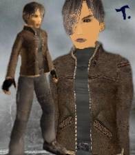
Better than the last version, but still not there...
Well, Leon Kennedy certainly looks good in the version, but there are some annoying bugs here and there. I'm gonna try and not be so in-depth as Death_spiriT, but share what I noticed when playing normally. Originality: 10 There is an older version, but this looks so different (and better) that it deserves a 10 in originality. :D Quality: 8 Ûber Bug-Meister Mr. Nice Guy has some info to share about the quality: Being a male outfit, it misses out on some joints. For some it's not as noticeable, but the shoulders and neck are bad. The arms are a bit different in the textures, so they stand out, and the neck isn't patched up and doesn't work well underwater (fortunately the head is patched up!). But the stomach is great! Apart from those, the hands go through the sleeves in the front, and there are lots of overlapped polygons on the headmesh, ruining that nice split in the hair... Normal problems galore, they are everywhere. Especially on the jacket and head. Last, the disappearing polygons. To be fair, the only ones that bugged me were the ones in the shoulders, so you'll only get a reduced score for those. Overall... I'll give you a questionable 8, because there are a lot of things dragging the score up as well (read on...). Useability: 10 For RE levels, city levels and... well, in fact quite a lot of levels, this'll work well. It's a male outfit for TRLE, but I won't take that into account. Full score! Meshes: 9 Mostly good and suitable, but there are the double-faces and missing joints to take into account. Plus the normal problems... Still, they are of wonderous quality, so a 9 for you! :D Textures: 10 Some are from RE4, some are custom. In any case, they're great! Most work, except the eyes and part of the hair. The eyes just don't look much like Leon's, and they're just a bit too small. The hair looks a bit weird in Strpix, and some of the weirdness is visible in-game, but overall the work is most pleasing, so I'll give you a 10 for the textures! Overall: 9,4 Bugs, bugs... Testing is vital, so take a look at everything, especially before you texture. Problems are easily spotted then. get the joints working, the normals corrected, double-faces removed, THEN texture. Saves a lot of trouble. ;) But keep your texture and mesh quality! see if you can do something about all the attached joints though, unless you have no choice.
(27 Mar 2005 04:21)
Hand-to-Hand Combat
by Johnny
by Johnny
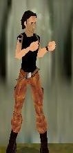
I'm not impressed.
Well, this works for distances as well. You might say that it's not possible to make "real" hand-to-hand combat in TRLE (and it isn't), but why make it, then? Here are the details: Originality: 10 Obviously, no one have ever attempted real-time hand-to-hand combat yet, so this gets a max for originality. :) Quality: 3 I rarely rate the quality this low, but this object simply doesn't work the way it should. She does punch, but she can stand far away from the enemies and kill them by punching the air. The animations are jerky and jumpy, and the meshes you used are far too large for a woman. I'm guessing they were for a male character but that was never specified. Still, you won't lose points for that. The thing that keeps this rating from getting 1 is the fact that the animations start, end and change without screwing up. So, you'll get a 3 for this... :( Useability: 10 Of course, hand-to-hand combat should always be an option, so the useability of the object is high! Full 10! :D Animations: 6 They are jerky and bad, but she does punch, and the animations change without messing up completely. Still, they jump from her to there when she "holsters", which is bad. I can't give higher than 6 for this... Overall: 7,25 This definetely needs more work on the animations, though I doubt "real" hand-to-hand combat is possible in TRLE. I'd rather use no weapons at all instead of hands that shoot for no apparent reason... Sad, because this is a missing element in TRLE.
(13 Mar 2005 03:40)

TR2 Movie Intro Music
by Sorata
by Sorata
Not quite there...
Well, this could be better. Its not a problem with the song, it's beautiful and very TRish, but it's in the mono format, making it a bit boring. Originality: 8 It sounds and plays like most intro music in TR, so the score is a bit lower. Quality: 7 The compression has turned the song mono, which is a bad thing. If it was playing quietly in the background, it wouldn't be a problem, but intro music has to be in a way that makes you feel that you're in the middle of the action, and this one doesn't cut it. It also starts and ends suddenly, which doesn't match the style. I can't go higher than a 7, I'm afraid... Useability: 10 The best games have a theme song, and a title screen at that, so you can use it, and with the TR fashion it works better for TRLE. So full score! :D Overall: 8,3333333333333333333333... Well, I guess the problem was that the tune wasn't stereo. Try to decide which songs can work with bigger compression and which won't before you compress, it can save a lot of trouble. Still, a nice choice for a song to add. :)
(06 Mar 2005 23:13)
The forcing tension
by Sorata
by Sorata
I'm forcing you to read this!
Perfect. You hit the nail on the head with the title: "The Forcing Tension". It's like, you know that something is gonna happen, and there's no way to prevent it. Like dying. For an "impossible" fight, it could work well as a warm-up, where the character heads down a long hallway to the final boss' chamber or something. Using this for direct tension would be wrong, as it's not at a point where you're in the middle of the action. Originality: 10 Most of the music on the site consentrate on atmosphere, but this one is in a category of it's own, so I can give you the full 10! Quality: 10 It's at 56 kbits/sec, but it's still at a great quality, and the compression doesn't ruin it, so a full score for you! :D Useability: 10 There are plenty of situations this could be used in, especially since it's in TR fashion. Many games have a final boss, so I'll give you a full 10 for it! Overall: 10 Very nice addition to a final level, and as I said, very useful for it's TR fashion. Excellent! :)
(06 Mar 2005 23:04)

Old house music
by Sorata
by Sorata
Rofl! Imagine a TR level with this!
Lol, just imagine Lara entering an old mansion, then the game turns into this old-school sidescroller Mario game with this music in the background! :D Originality: 10 Who ever thought of a Super Mario tune for TR? Interesting idea! It gives a 10! Quality: 9 Well, it's MIDI-quality music, and there are some in-game sounds in there (the door closing), so the quality is a little lower. Also, the ending is a bit sudden, but it's not much of a problem, so I'll give you a 9. Useability: 6 It's hillarious, and you really have to go for a suiting level to make it fit. That's really the only flaw of using such music, but for the fitting, it's awesome! :D You'll have to settle with a 6 for the slight usefulness though... Overall: 8,33333333333333... It's interesting with these ideas, and it's daring to make them available, but we need more of these funny things on the SE, so good thing you added it! :D [i]Edited by MrNiceGuy[/i]
(06 Mar 2005 22:50)
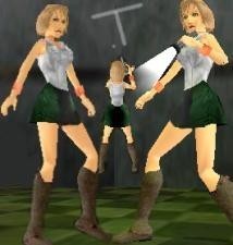
Heather (Version 2)
by Trinity
by Trinity
Improved, but...
Okay, with the first outfit covered, let's look at the improvements! :D Originality: 9 [quote]Heather Mason is a treat. She looks rather good, but she wears odd clothing... Anyway, this combination makes her quite original![/quote] And it still does! Well, one point off for this being the second version, but it's still a 9! Quality: 8 [quote]...then there was the quality. I know people hate me for reviewing this, but somebody has to... Anyway, let's get started. The most obvious flaws are the holes in the torso, which is probably because this was Trinity's first outfit when working with less joints (or was it? I'm not so sure...). They aren't all that visible in-game, but can occationally be spotted. Next, the upper arms don't rest well on the shoulders, they kinda sit a bit away from them. It's a bit more noticeable than it should, and the fact that no holes in the torso are patched up makes it worse. Speaking of which, the hole in head is not fixed either. Finally, the skirt is stiff and ugly, but since there were no alternatives at the time, I'm gonna let it slide. ;)[/quote] Remove the section with the holes in the torso, but add that both the left elbow and right foot joints are broken in this version... So, still an 8, I'm afraid... :( Useability: 9 [quote]She's useful in Silent Hill levels (especially since she's still alive), but her taste of clothing kinda lowers her use. She also strays quite a bit from the "real" Heather's look...[/quote] Nothing to add or remove, she still suffers from the facts below... So still a 9. Textures: 9 [quote]She looks too healthy! I mean, she looks like she spent a summer in the tropics; getting a tan, plenty of sleep and eating healthy... And where did she get all that make-up from? Heather should look more like a drug-wreck, with her bags beneath the eyes, obviously dyed hair, pale skin and white-trash clothing. Still, they are of great quality, and the clothes look just right (apart from the "waist pocket dilemma").[/quote] Same as before, except the hair being dyed better (but still too good for Heather's poorly dyed hair), and the boots have cute little buckles! :) Still, a 9 for the stray from Heather's "real" model. Meshes: 10 [quote]Stunning head, and awesome jacket! The flaws are the polygon-gaps in the torso, and the boots, they aren't quite right.[/quote] Much better with the torso, and the boots have cute little buckles now, so nothing to downrate! Full score 4 U! :) Overall: 9 The overall score remains, but it's still better than the last version. There are some things that still need fixing, and I guess another version would be good for the picky (me), but this one should work for most people. Anyway, nice work on the fixes! :D [i]Edited by MrNiceGuy[/i]
(06 Mar 2005 22:23)
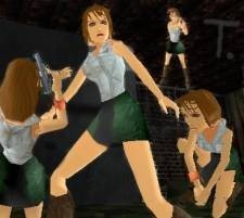
Silent Hill 3: Heather (Vr1)
by Trinity
by Trinity
Decent.
Hmm, I think I'll review both versions of the outfit, to see how it improved in version 2, and give some general advice, suggestions and praise. :D Here goes: Originality: 10 Heather Mason is a treat. She looks rather good, but she wears odd clothing... Anyway, this combination makes her quite original! Full score! :D Quality: 8 ...then there was the quality. I know people hate me for reviewing this, but somebody has to... Anyway, let's get started. The most obvious flaws are the holes in the torso, which is probably because this was Trinity's first outfit when working with less joints (or was it? I'm not so sure...). They aren't all that visible in-game, but can occationally be spotted. Next, the upper arms don't rest well on the shoulders, they kinda sit a bit away from them. It's a bit more noticeable than it should, and the fact that no holes in the torso are patched up makes it worse. Speaking of which, the hole in head is not fixed either. Finally, the skirt is stiff and ugly, but since there were no alternatives at the time, I'm gonna let it slide. ;) 8 4 U. Useability: 9 She's useful in Silent Hill levels (especially since she's still alive), but her taste of clothing kinda lowers her use. She also strays quite a bit from the "real" Heather's look, so a 9 4 U. Textures: 9 She looks too healthy! I mean, she looks like she spent a summer in the tropics; getting a tan, plenty of sleep and eating healthy... And where did she get all that make-up from? Heather should look more like a drug-wreck, with her bags beneath the eyes, obviously dyed hair, pale skin and white-trash clothing. Still, they are of great quality, and the clothes look just right (apart from the "waist pocket dilemma"), so I'll give you a 9. Meshes: 9 Stunning head, and awesome jacket! The flaws are the polygon-gaps in the torso, and the boots, they aren't quite right. I can give you a 9 though. :) Overall: 9 I liked it overall, but it was so different from the "real" Heather... Don't be afraid to make her more true to SH3, that's what people want, you know! Now then, with the first outfit covered, let's have a look at the [URL=https://www.trsearch.org/Media.php?action=getitem&dbitem=1488]second version[/URL]!
(06 Mar 2005 22:02)
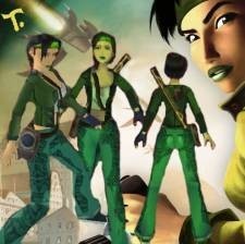
Jade
by Trinity
by Trinity
Hmm, plenty of bugs, but awesome tetures and meshes!
Yet again Trinity shows of her great textures and meshes, but yet again, missing connetions and double-faces ruin the overall look... Let's take on the outfit! Originality: 10 Jade is a very unique character, and she's quite different from all the other outfits on the SE, so she gets the big 10 for originality! Quality: 7 I know I'm picky, but this is crazy. The meshes and textures look great in Strpix, but screw up in-game... First of all, missing connections. The foot connections are gone, but it's not a problem unless you crawl, which reveals quite a lot of missing polygons underneath the pants. Since crawling is a big part of TR and BGE, this is bad. Second, the torso. All the connections except the waist are connected to it, but it's only really a problem on the left shoulder, where the arm is transparent underneath, creating a hole... Third, the right knee joint is broken. Finally, the hole in the head is not patched up. Next we have the double-faces. They may or may not be real double-faces, maybe they're just too close to the polygons underneath, but there are quite a few in the arms and torso. Last, but not least, there are plenty of normal problems in the legs, torso and arms. You'll have to settle with a 7, that's the highest I can go. Useability: 9 Great for BGE levels, as she looks very much like Jade, however, it requires a lot of custom objects because of the cartoonishness of BGE, so I can only give as high as a 9. Textures: 10 One word: Amazing! They look so much like Jade's real textures, and are applied flawlessly! The hair is a bit weird, but it's really not problem. Small details like Jade's Scanalyzer are there, and the Daï-jo looks very authentic! Excellent piece of work! I'll give you the grand 10! Meshes: 10 Again, they are simply great! All the small details are covered, and the shirt is even 3D! Jade's head looks great, and the pants are excellent! Look at that backpack and Scanalyzer! I'll give you another 10 for the meshes! :D Animations: 5 Well, these are bad. Nothing more. They could be good if it wasn't for the fact that the Daï-jo does no damage, and kinda jumps from Lara's normal position to her holding it unbalanced... I think the outfit would've been much better off without it, or just with the normal animations. Maybe you could make it so that Jade only uses her special powers to utilize the blasts of the Daï-jo? Ideas are many, but TR is not a very good engine... Overall: 8,5 A very good outfit of Jade, but requires some remapping and testing before it can be considered for a level. I'm looking forward to the next version, I know you're making one! ...right? You should, as it has potential. :)
(06 Mar 2005 14:10)
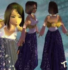
FFX Yuna
by Trinity
by Trinity
Hmm, stiff skirt is not my cup of tea.
Idea: Good. Performance: Bad. The thing that puts Yuna down is first of all her dress, which is stiff and weird, but also the fact that she seems incomplete... Read on. Originality: 9 We've already have a Yuna here, though from FFX-2. Also, we have a Rikku (from Trinity as well), which uses a similar style of clothing. So, a small lower in score, but still a 9. Quality: 8 A stiff dress is never good. Don't use them, work around them. Like with Peach. I made her a swimming suit instead, since a stiff dress would've ruined her movement. The dress doesn't seem like a bad idea at first, but when using various of Lara's moves, it becomes evident. The other thing that brings the quality down is the normal problems on most meshes. There's the golden button labeled "Re-calculate Normals", use it! :D So, an 8 for Yuna. Useability: 9 Final Fantasy levels could use Yuna, or maybe another fantasy typed level? Maybe even as a ball dress or similar? Still, it gets 9 because of the difference from FFX's Yuna (covered below). Textures: 9 They're very good for the dress and arms, but the head looks so different from Yuna's... Her eyes are a bit too narrow, and the same colour (Yuna has one green and one blue), and the mouth is also too narrow. The hair looks a bit static, some tolerance and variation would've been good. Still, a good 9 for the textures! Meshes: 8 Stiff dress. 'Nuff said. Lol, just kidding, I'll make it more described! :D The skirt IS stiff, and it lowers at least one point, but the other point goes for the head. It's different from Yuna's, and doesn't really show the Trinity quality of heads... The mouth is also deformed, which is NOT good... I'll give you a strong 8, I can't go higher... Overall: 8,6 Yuna looks good, but not quite as graceful as she should. For a character like her, you need custom animations, and a better dress. Still, you got some small details, like her necklace, which is good! The outfit requires some small rework, but is not the worst I've seen. :)
(06 Mar 2005 02:10)
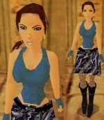
Raider In Blue
by C/y
by C/y
Uhm? Lara the hooker on her next exciting adventure? Nah.
This was on place 1 in the Top 10 for a long while. When I tested it, I was surprised of how buggy the outfit was. Not to mention Lara looks like a hooker. I'm really sorry, but this is a bad outfit. Originality: 8 The colour blue is new, but everything else in the outfit has been seen before. The "skirt", the boots, the pantyhose, the earrings (though they're 3D now), and the torso. The textures save it from getting lower then 8, though. Quality: 6 Sloppy. Missing connections, stretched joints, normal problems etc. First of all, the missing connections. The most obvious one is the stomach, which even is transparent underneath, revealing Lara's polygon-ness for the world to see... Then, we have one shoulder WITH the joint, and one WITHOUT. The one without is easily spotted since the one with reveals it instantly, and occationally you'll see a black polygon and the stretched joint coming out from it. It's a strange bug, but after a while, it's evident... Next, the leg/foot connection. It's not there. Just a transparent opening, revealing the translucency inside Lara... Then the neck. Missing, without patched up hole in the head. I think that covers the missing connection problems. Next, normals. Most of the meshes are affected weirdly by lightning. Especially the torso. Hmm, I think that covers the bugs. Upside: Rest of the joints are working, even the skirt ones! Useability: 9 Lara going underground as a hooker isn't that hard to imagine, but it's not the way she works, and the kinda lowers the score a tad. Textures: 8 Boring, but good enough. Blue is a fine colour, but there were only two main textures in the outfit. They were of reasonable size and quality though, so I'll give you an 8. Meshes: 8 Mostly borrowed, and usually fine, but plenty of bugs. The skirt doesn't work for me, as the textures reveal the opening too much... They are not anything special, but work in a way, so you'll get an 8. Overall: 7,8 This could've got a worse score, but still, blue is an interesting colour, so it kinda saved it. I would recommend using remapping more, as the missing connections ruined this outfit... Sorry, but that's the way it is. :(
(06 Mar 2005 01:43)
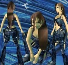
1 Year Anniversary
by Trinity
by Trinity
Quite a few bugs, I'm afraid... :'-(
Well, looking at this outfit in Strpix is eye-candy! 3D clothing, few but well used textures, and lots of buckles and skin showing here and there. It would appear to be very good, with shiny effects and wonderfully remapped joints, but there are more things under the skin than it appears, and not only double-faces... Let's have a look. Originality: 10 This outfit is wacky, and really sticks out! Unique design, interesting colours, and even a new hair-style! It deserves the big 10! Quality: 8 Unfortunately, 8 is the highest I can go. There are some nasty bugs in the outfit, and I didn't even have to look to find most of them. First of all, the hair reacts weird with Lara's movement. That wouldn't be a problem unless you look at it from the side. It kinda jumps out and then goes down a foot away from the base of the hair. The only way to fix this would be to make the hair go further out than really close to Lara's neck. Next, we have the upper legs. The whole front is covered with annoying double faces. Also, the faked connection with the pelvis isn't very good, as it kinda sits beneath it instead of coming out from it... On the plus side, the connections to the bottom legs are superb! Last, the disappearing polygons. As mentioned before, when viewing the outfit from the sides, some suddenly dissappear, especially in the torso area. It's not so noticeable though, so I won't charge you for it. ;) So, an 8 for you. Useablity: 7 Hmm, where could this go? I'm thinking high-tech, but it's still very strange there... You're gonna have to work the story a bit around the outfit for this to work, and it kinda reduces the use... You're gonna have to settle with a 7... Textures: 9 Well, they only cover a page and are fairly small, but that's a good thing. They are of good quality, and the silk looks like silk! The way they match the outfit is mostly good, but at some places the design gets confusing. That can be good or bad, but I'll give you a 9 for the quality! Meshes: 9 Ah, yes, the meshes! Simply put: Well done! A lot of work with 3D clothing! I like them, I only have some small complaints, and that's the double faces and faked connections. The hips are far too noticeable, I know it's hard to work with them, but from the front you'll see it at once, even from the side. So, a small reduction in score, but still a solid 9! Overall score: 8,6 A very good outfit indeed, but there are plenty of bugs, and it's hard to place it in a level. The unique style is completely new, however, and the work on the clothes is very good. It's definetely worth your attention, and could be used if you want to make a story for it! I deem it: Cool and stylish! Happy 1 Year Anniversary, Trinity! :D
(06 Mar 2005 01:11)
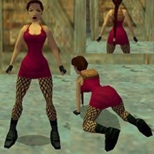
Stretch dress
by Poison Ivy
by Poison Ivy
Amazing!!! Perfectly modified joints!!!
*Note: I will only review the new meshes and textures of the outfit* I was blown away when I saw the new joints in action! Never before have I seen such an amazing skirt mesh! It animated perfectly, and looked totally natural (except the textures, but that's another part of the review). This will definetely be used for Cate Archer: Casual! Quality: The skirt mesh had no problems in-game, no stretched polygons or missing joints. And of course, all of the meshes funtioned flawlessly. Meshes: Perfect. The skirt mesh looked strange in Strpix, but as many other outfits, it looked awesome in-game! How you did it is beyond me, would you mind telling me how you managed to make the new joints work 100%? I'm thinking of using the techique for another New Era outfit if you tell me! Textures: The downfall of the outfit. A pink dress isn't so bad, but very flashy. The textures were mostly modified from the original ones, but the ones at the bottom of the dress didn't look natural, but very simple. They could have used some more work, as they didn't quite look like fabric. The shoes weren't anything special, but the string-stockings didn't fit in at all, simply using Lara's normal legs here would've been much more effective. Overall, THE dress mesh to use if you need a skirt. No more using static skirts attached to Lara's pelvis! If you do, expect an angry review from the detail freak of the site... Awesome work, Ivy!
(19 Feb 2005 13:16)
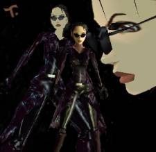
The Matrix: Trinity
by Trinity
by Trinity
M-must... find... BUGS!!!
Must f-find... s-s-something... NEGATIVE... t-to say... AAAARGH!!! It's not enough!!! Stupid Trinity didn't mess up!!! Can't act like a SMART-ASS!!! :mad: Oh, well, I'll just give you a fair rating, then :) Originality: 9 There has been a few Matrix outfits before, 2, to be exact, plus a look-a-like with a different name. Still, this one has taken full advantage of the TRC shining effect (which I released with my Assasin's Catsuit), and it makes it a bit more sophisticated than the rest, so I'll give you a nine. Quality: 9 There are no LARA_SKIN_JOINTS in the outfit, which would be the perfect downrating source. However, Trinity has done an amazing job hiding the missing connection, especially in the stomach area! The only ones I could bitc... I mean, moan about, would be the neck and hand joints, who both have some holes in them, and no polygons to hide them with. The head also has that connection hole, which makes the outfit unuseable underwater. However, that shouldn't be a problem, since the Matrix doesn't involve much water. Also, the lower right arm isn't correctly placed on the upper, and sticks out a bit. It's hardly noticeable though. I'll give you a nine, mostly for those amazing connections. Useability: 10 Perfect for The Matrix levels, and works well in high-tech levels that doesn't involve underwater areas (few do). Full score is due! Textures: 9 They are black, but have some details, and the shine saves the totally black ones. The only drawback is that some apear to be a bit strethed and badly rotated, though it may just be an illusion. The head looks stunning, and bears an amazing resemblance to Trinity! One nine, coming right up! Meshes: 9 Apart from the holes in the connections on the hands, lower arms and head, they are very good! The head looks, like I just said, simply amazing, and the meshes and textures work so well together it's incredible! The torso is also well made, and the shoes are fine. I'll give you a nine! Animations: Not rated Fortunately, you didn't make these, as they are choppy and bad. Won't downrate though. ;) Overall rating: 9,2 / 10 I was waiting for Trinity to create herself, and finally she did! I'm glad I was able to help, and I can see it wasn't in vein! If I ever need to make a joint-less outfit (maybe for TR3), I know where to look! This really deserves a place in the top 10! Great work! ...s-she got away once... ...and I h-hope she will again... ...my precious...
(19 Dec 2004 21:47)
Showing 1 to 15 of 136 reviews