
This is a Beta version of trsearch.org, more info in What's New page. Did you found a problem? Please report to info@trsearch.org
Showing 1 to 15 of 19 reviews
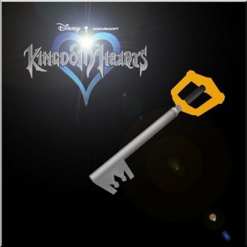
Kingdom Hearts Keyblade (Item)
by Laras Boyfriend
by Laras Boyfriend
Wow, this is some very incredible work! I'm very impressed ^_^ It's very beautifully made, looks completely organic. I love the trunk of the tree especially. The twisting is really pretty. Also the textures are very high quality, I love the colors! I know it isn't completely original to make a tree, but for what it is, I give a 10 anyhow. The quality is top notch. Love it! I hope to see it in levels soon! :D
(10 Aug 2011 04:26)
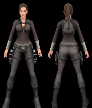
Manor Redux
by Trangel
by Trangel
Wonderful :D
Originality is a high mark simply because I haven't seen anyone else make this outfit for TRLE. :D Quality is top notch as always, her body proportions are spot on, she is lovely! :) I feel that even though it's the outfit from TRU's Manor levels, this could really be used just about anywhere, even in cold levels. :D The custom textures were cut from TRU textures and the quality of them is fantastic, I love that you were able to keep the ribbed texture of her sweater. :D It's probably my absolute favourite part of the textures (aside from her lovely face of course lol). The custom meshes are also wonderful and detailed, I really enjoy them! I really liked your chest mesh especially, and you already know how much I love her headmesh. :D Great work as always! Keep up the lovely work Trangel! You're my favorite outfit creator too, you've come a very long way. ^_^
(16 Oct 2010 18:22)
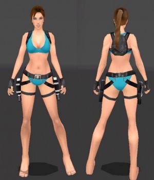
Bikini Outfit
by Trangel
by Trangel
Nice! :D
I really like this outfit you've done, I think the quality is outstanding. :) Again I love her new face you've created, she looks beautiful. I really like the chest mesh, moreso than your later nevada and TR3 etc. Not to sound crude but, I like the shape of her chest more in this outfit, she looks a lot rounder in the busom lol. I also really like the textures too, the detailing in her bikini top's stitching is nice to see, even though from afar it's not really noticable. I like the fact you added her pack and holsters, it does make it more useable, though obviously no one would use this in a snowy level, or something cold etc. I think for what it was made for, it definitely has no competition. :) I also really like the fact you added in all her muscletone, not just from textures but in the meshes themselves. Really gave her legs more shape, as well as her arms too. I like her feets too. XD They're cute :) Though I think it'd have been nice if you'd detailed the bottom of her feet with textures a bit more, but it's not something you'd really notice so I wouldn't take points off for it. Also like someone else mentioned, I think the stand animation is nice but it isn't necessary. I'm not sure if you'd intended to include it since it looks like the one you use when screencapping. Would be neat to see it more animated but I'm not gonna count it here since it's more like an afterthought. Overall great work, you've done wonderfully. :)
(07 Jun 2010 02:58)
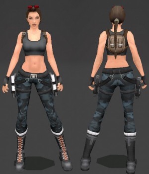
Tomb Raider III Combat Attire: Nevada
by Trangel
by Trangel
:O
Been going through your outfits since it's time I review publicly too lol. First off I have to say that I think you've created the most beautiful Lara out of all the outfits on the site, and I'm not just saying it, I truly mean that. Your new Lara is very well made, I'm actually jealous. XD Her face is what really blows me away, though. You did a beautiful job, definitely puts the rest to shame. :) As far as the textures are concerned, I think they're all lovely, and well applied. I really give you kudos for the nice camo textures. And you're right we definitely needed something new. XD The AOD textures are so overused. :S I think the only suggestion I have is about her chin, and this is just my artistic preference so don't take it too badly lol. I feel that it should be a tad longer to give her more chin over her neck, since from the side, it looks almost too straight. Not sure how to explain it... Though I think if it was longer it might make the chin look too long from the front... so perhaps angle the back of the chin more, and elongate the neck? I dunno, it's just an observation. Really it's not an extremely necessary change lol. just a preference of mine. Other than that I really think you've outdone yourself most definitely. I think if you also added the rest of the weapons in with your new outfits they'd be even more complete. Great job! Keep up the lovely work. :) Thanks for inspiring me to come back to outfit building, it's really been a joy so far. :) Can't wait to see what else you have coming up! ^_^
(07 Jun 2010 02:26)
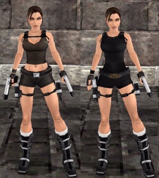
TRU: Dual Outfit release
by Trangel
by Trangel
very nice! :)
This outfit set is definitely an improvement on the last one you did, I must say I truly was impressed. :) Her face especially is beautiful, even though she doesn't have the usual 3D lashes she looks superb. :) And during gameplay lots of detail can be lost since rarely do you see the model up close anyway... so really I think it doesn't matter hahah. :3 I played through a few levels with the movie version and looked at your TRU version in the Karnak level, both look really nice. :) Seamless texturing! You cut them and everything very well. The meshes look a lot better too. No offense is meant by this but, in most of your previous outfits her butt seemed to square somehow, and in this model it looks more smooth. :) I like the improvement. :D Her arm meshes are also better, with more vertices at the shoulder. I must ask, did you alter the arms from my Masurao/Menetnashte skin? It looks awfully similar. :/ Nonetheless, very well done! :) I think this skin even beats the quality of some of PoYu's stuff quite honestly. You've gotten so much better at human proportion! And I have to say the stronger shoulders of your models makes more sense for Lara. She should have a lot more upper body strength than she usually looks to have hahah. So great job! You made a model that's really believable, and she looks even more realistic now. Beautiful job overall, I'm truly truly loving this outfit to pieces. If I ever levelbuild (or rather, actually FINISH something lol) I'd definitely have to use your skin in a level. She's just too gorgeous not to get some love. ^___^
(17 Aug 2008 06:44)
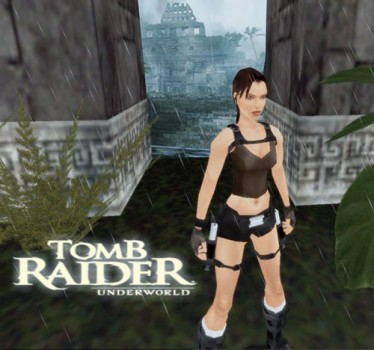
Tomb Raider Underworld Outfit
by Trangel
by Trangel
Underworld :D
Guess I'm the first person to review this lol! Anyway, I'll start with the good aspects. :3 The originality isn't 10/10 simply because well, the outfit design isn't your idea it was from Crystal Dynamics, but all the same since there aren't any other Underworld outfits here I'll give you a 9. :) Quality was pretty good. I'm not a huge fan of her headmesh but that's more just my personal preference. Not a huge fan of Legend's style face, but other than that I think it looks nice. :) The textures look to be from Legend as far as her skin goes and all that, so the textures were nicely done. You cut and applied them really well. :) the meshes were all pretty good too. :) One problem I had, and I am not sure if this was just because of the level or what, but the lighting looked really awful on her. It looks as if you didn't re-calc the normals after importing/remapping the vertices. I tried other outfits in the same level and the lighting looked fine on them, so perhaps this would be something to look into? Other than that the rest looked really nice. Really good job for only having worked basing it off of the screenshots. Now there are bigger and much better quality model shots out if you look on the TR website's forum. :) Lara's looking more like Lara these days, especially facially, which I'm really excited about. :) Overall TRangel, I think you did a lovely job. I don't want to sound like it's all negative, I just think there are a few things that need work. Otherwise it looks awesome. :) Keep up the good work. :D
(10 May 2008 20:35)
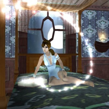
Midnight Fashion
by White Tiger
by White Tiger
Yay!
Originality: 9/10 Dress outfits have been made before, but yours is still a very unique design, and I loved the diamond trim and everything. :) I also really love her shoes and her jewelry, beautiful work! :D ---- Quality: 10/10 Quality is really really great, your best yet I would say. :) Her legs look very good, more proportionate, and her headmesh is excellent. :) Overall very well made. :) Her chest mesh is also well done. ^_^ ---- Useable: 10/10 It's usable for what it's made for, and that's good enough for me. :D I especially enjoy your Hollywood version. XD It's so true! Bleach blonde is definitely all the hype. You captured it perfectly. I think my favourite is the wine version. Very pretty. :) The white is elegant too. Heck I like all of 'em. XD ---- Custom Textures: 10/10 From what I can tell they're all original. :D And I love original textures! ^^ You also added some shadows to define her form more, it's definitely another great step up. Lovely job. :D The variety in color choices are good too. :) ---- Custom Meshes: 10/10 I really like the new meshes! ^__^ I have to say I think her feet are my favourite since you put so much detail into them. And you're the first person to give her true high-heels! ^__^ I like her head mesh too of course. ---- I didn't see any custom animations? Overall I have to say I was jumping happily in my seat when you released this outfit. :D I'm just sorry it took me so long to review. D: Keep up the lovely work! You said you're holding off on making new outfits because you're persuing a project? I wish you luck with the project, I look forward to seeing it. ^__^
(10 Mar 2008 23:32)
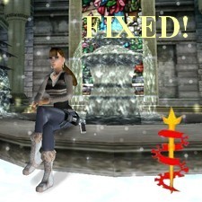
Urban Fashion- Diesel
by White Tiger
by White Tiger
Very nice! :)
Y'know, I thought I'd reviewed this but I guess I hadn't! Well here we go then. :) Originality is very high! All your outfits are very classy, yet modern. They always fit Lara's character very well I think. And this one is no exception! :) I think the outfit is quite cute. Most of your styles come from existing fashions of designers and such, so I'm not sure the originality in design is quite as high because of that, but yet we don't see it in TRLE much. So originality is a ten. :) Quality is a 9! I thought her skin textures and hair looked really pretty, and very well matched up and natural. The clothing textures were quite nice as well! I have always admired your jean textures... you keep me wondering how you do it. xD I think the only improvement here I'd recommend, is adding some shadow definition in her top and the other accessories that have no shadows. Also like PoYu had said, improved body proportions would make your outfits even more realistic. From what you're working on right now I think you're headed in the right direction in that respect though. ;) Usability is obviously a little limited, but that wont detract from your rating as far as I'm concerned. She probably wouldn't be climbing around tombs in this, but definitely some sort of city, wintery level would look nice. I didn't see any new animations, did I miss something? Overall I think this is very well done. I'm definitely looking forward to your next outfit, Midnight Fashion! :D
(02 Sep 2007 10:30)
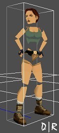
New Stand Anim
by d|r
by d|r
originality: 10, because I haven't seen this done before (hands on hips look around animation), making yours the first. quality: I'm sorry but I had to mark it a tad low. While the lead into the animation, the animation itself and the lead out was good, it went too fast and looked unnatural because of this. I think if you extended the animation time (when she places her hands on her hips and looks around) and put more time into making her look around slowly, adding in breathing and perhaps more movement in her legs (just a slight movement, like the rest of the standing animation) it'd make it look less mechanical. Other than that, you did pretty well on it I think. use: can be used anywhere. :) That's the beauty of animations. custom animations: (see quality)
(25 Aug 2007 22:42)
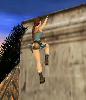
Ledge animations
by ayal91
by ayal91
nice! :)
I dunno, I think you're too hard on yourself. XD I thought the animations were fine. :3 Her right leg sorta goes through the wall when she's still, but other than that I think it looks fine. :) I especially liked the climbing up animation. You gave it a fluid, more realistic look and makes it therefore, more convincing. I couldn't figure out what keys to press to do the jump off the wall, if that's what you were speaking of, however. Overall I'd say you did a wonderful job. :) The shimmy animations could be a bit better but I think they looked fine as they were. :) With a bit of polishing I think they'd look perfect. Great job!
(22 Aug 2007 10:55)
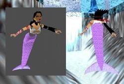
Nuroe (mermaid)
by TifaNazah
by TifaNazah
Well, I just got through playing your ice cave levels since I'd found your outfits on here just because I was curious. Very nice levels, I loved the fantasy atmosphere. :) Not to mention you picked wonderful music. but that's not what this review is for lol. Originality: I'd never seen a mermaid attempted in outfit creation before, kinda wish I'd thought of it hahah. very nice job! Quality: the model itself could be better, but overall I think you did a fair job. I think if you'd made her tail bend a bit more (at the "knee") it would have been more confincing and not so stiff. Looking at the LARA slot to see how the pieces fit, Probably would have worked slightly better if you'd made the tail in three pieces instead of two. But that may just be a personal preference. I think it would have come off better. But, for what it is and since it is new and a first attempt at such a thing, I think you did very well on it overall. :) Textures: Most are solid colors, not really any texturing. the tail looks gorgeous though. I love that purple color, went very well with Nuroe's other colors too I think. Meshes: I'd already sorta gone through this but, the meshes were pretty well done. :) The tail looked very nice overall. Usability: For what it was made for, this could definitely be used. Water levels would be the ideal. I think with TREP you could make it so her breath never ran out, which would make it even more like a mermaid. :) Animations: They look pretty smooth over all, the swim animation I liked the look of. Nice job. :D
(10 Aug 2007 22:00)
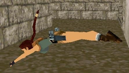
STAND-ROLL ANIMATION
by ayal91
by ayal91
Awesome!
Very well done animation! I had to add them and then put them in different animation slots so it wouldn't over write some others I was using, but other than that very good! :) The quality is wonderful, and this animation could be useful anywhere. I'd been waiting for someone to make this move for Lara. :D Over well done!
(10 Aug 2007 02:38)
Tomb Raider Anniversary Outfit
by Trangel
by Trangel
Another wonderful piece!
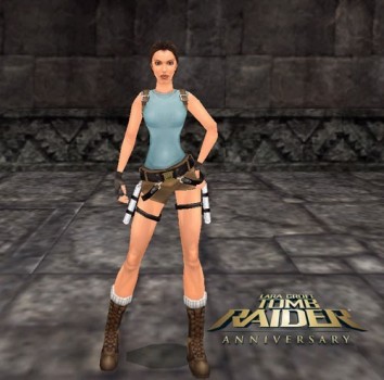
I was originally hesitant to download this mostly because we've been seeing SO MANY Anniversary remakes lately, but what the heck, I download everything. XD Besides, your enticing description of a smoother Lara had me wanting to take a peek. Originality: I must say that, the originality will be a tad lower in score since it is a remake and all. But still, because these textures are new from what I've seen here on TRSearch, I'll mark it as a nine. Quality: I will be honest with you and say, that the quality of the meshes could be better in my honest opinion. The increased points are fantastic, no complaints about making her smoother. But, her boobs ('scuse me for saying lol) look a bit... I dunno, "squished" I suppose. From a side view point I mean. As if she were wearing like a, corset or something of the sort. She could be wearing some crazy bra I suppose... but anyway. xD I think they could be a bit fuller. Straight on they look fine though. She also seems a bit too thin, like her ribcage isn't as proportionate with the rest of her, but that could just be me, I dunno. So I wouldn't take any points off for that. The textures, while lovely and cut very well, did seem a bit too harsh on the fronts of her upper legs. they didn't quite blend to the back of the legs as well as they could, but still it looks really nice! Good to see a Lara with more muscle definition. She should have crazy strong muscles you know? Overall I don't want you to get the wrong idea, I think this outfit is very well done! Just a few things I think could be improved. Other than that it looks superb. I'd say the best Anniversary remake here. Usability: This could be used virtually anywhere aside from winter levels I guess, but heck even the original TR had her running around in this in the winter so I would say it could be used anywhere. It's her official garb afterall. Custom Textures: Since they're from Anniversary I'd have to give a nine, but other than that they're very well cut for the most part and they look fantastic! I especially like that you captured the ribbing in her top, too. I was afraid the restraints of TRLE would cause too much detail to be lost since textures have to be so much smaller. Meshes: As said earlier, the chest is really the only thing I'd suggest improving. Other than that the rest looks very very well done! I especially loved the head meshes. They looked so much smoother and younger, too. And I loved the "SCREAM" headmesh too. the teeth detail was awesome. It totally looked like her from Anniversary. Animations? I didn't see any new animations. Overall, fantastic job! I'm glad to see someone devote so much time and energy into making such a beautiful Anniversary remake. I think you should definitely be proud of what you've accomplished! Definitely surpasses most if not all outfits here. You definitely have your own style. :) PS: sorry for rambling so much D: [i]Edited by Horus-Goddess[/i]
(05 Aug 2007 12:33)
Legend Winter with Coat
by Trangel
by Trangel
Very nice!
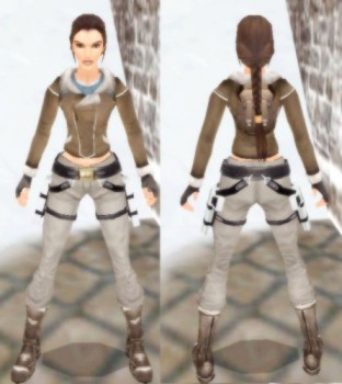
Well, when I first saw this outfit I was ecstatic since I really did love this outfit from Legend. The coat and the pants, great colors and all that. looked awesome. So to see that you've remade it made me very happy! Not to mention you did a fantastic job. :D Originality: Since it's from Legend it's not completely original so, my score is 9. Quality: Very well done! The meshes were fantastic and detailed. :) Useable: Obviously this couldn't be used for every level type but, for what it's made for absolutely. :D Custom Textures: Since the textures are from Legend I couldn't give full credit, but you did do all the cutting and stuff which I know takes a heck of a long time, so great job on making it look so nice! :) Custom Meshes: Very well done! No holes from what I can tell. I think she's a bit too thin around the waist, but it's Lara so I wont nitpick too much lol. She looks awesome. :) I didn't notice any custom animations even though you did provide the LARA slot with this... though, the pistols and such had custom animations (which I think are by PoYu if I'm not mistaken?). Overall, wonderful job! I have to say, the in-game version looks far better than the screencap image with this item lol. It far surpassed what I had originally thought. Nice! :D
(05 Aug 2007 12:01)
Lara Croft
by Trangel
by Trangel
Awesome! :)
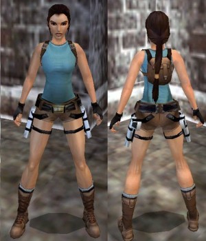
This is probably the first time I've reviewed anything of yours but make no mistakes, I think all your work is very well done! Originality: I gave a lower score because the Anniversary outfit has been done before by yourself and Po Yu already, I think you have a few different remakes if I'm not mistaken. Still, this is really nicely done and therefore the score isn't lowered that much. Quality: I think it is very nicely done! I actually really like how natural she looks. More like a real woman than her usual over-endowed self. xD I only didn't like so much the way you modelled her boobs dare I say... they looked a little odd when viewed from above or below in shape. profile wise they looked nice though. :) The textures were nice too, if I'm not mistaken some are from TR Legend? Useable: Anywhere really, aside from arctic levels or something obvious like that. lol Textures: I think the ones you used for the guns were yours? They were a little white, but I actually liked it that way. I expecially enjoyed the bullet casings! and the barrel of the gun too! Meshes: The GUNS! They didn't look like much from afar but viewed in Strpix they're really impressive... you gave the gun a visible inner barrel, if that makes sense, something I've never seen done before! I also enjoyed the bullet casing! Though, if I'm not mistaken... casings don't have the tip still there after they're fired. I could be wrong as I'm not a gun expert. lol Animations: I love the way you made her hold her pistols! Very cool, and makes it look fresh and new. Overall very nice job! I feel like I missed something. At any rate, nice outfit! I would love to see you model the other weapons in her arsenal as well to go with this some time. That would be cool. :) sorry for my rambling, I have a bad habit of talking too much. XD
(22 Jan 2007 03:37)
Showing 1 to 15 of 19 reviews