
This is a Beta version of trsearch.org, more info in What's New page. Did you found a problem? Please report to info@trsearch.org

Michiel
Birthday: 21 May 1986
Gender: m
Items
79
79
Reviews
80
80
Follower
0
0
Showing 16 to 30 of 80 reviews
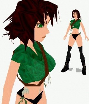
Manga Girl
by Golden Dawn
by Golden Dawn
Weird but wonderfull
It's a very weird outfit, but it still looks nice. Nice meshes and texturing. But the problem is where to put it. I can't think of a level, but I hope someone thinks of one cause I like to see this one being used.
(05 Apr 2004 21:36)
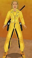
Kill Bill outfit
by lara-carter
by lara-carter
Well I must say, the textures are a bit to big. Come on, 3 233x228 textures for the hair. The headmesh is wonderfull, but it would look even better with 6 128x128 textures instead of 3 233x228 textures I think. The legs were nice but the joints were missing so it looked a bit broken. The meshes (except the head) looked from the antartica outfit so that would explain the missing joints.
(03 Apr 2004 20:06)
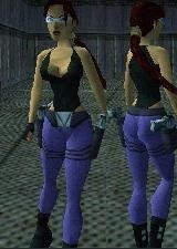
jeans 2
by Danilo
by Danilo
some texturing probs
The outfit itself looks good. The meshes are also nice and from a distance the textures look fine. But looking closely there are some incorrect rotated textures on her legs. You might notice these while playing with this outfit in a big level. The first look is nice however.
(03 Apr 2004 19:16)
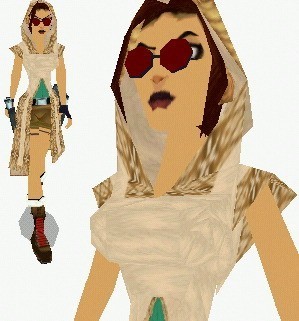
Desert Rose
by Golden Dawn
by Golden Dawn
the head....
Her head had a little problem. The head was integrated with the torso mesh in order to avoid problems with the cape. But now she cannot turn the hear normal and the when shooting there are strange effects. And the sunglasses also looked a bit strange... The rest of the meshes however are nice as well as the textures.
(03 Apr 2004 19:04)
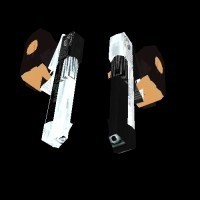
Gunpack 7
by Silent Viper
by Silent Viper
Great guns
It has some great new guns, to bad you can't use all of them at the same time. One of my favorites is SHUTGUN from wad2. It's really powerfull so the ideal gun for a place where many enemies come over to you. The guns in the CROSSBOW slots seems to have small bugs, they fire huge arrows instead of tiny bullets. It's a good idea the clear the crossbow arrow mesh when using these.
(13 Mar 2004 23:00)
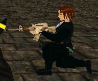
Female SAS
by TifaNazah
by TifaNazah
Equal battle
Finally a girl vs girl fight. The head mesh and textures look nice and so does the gun. Only she does not hold the gun like she should. Also a good idea to put the same gun in the wad for Lara as well, now they have same changes to win the battle. Woman vs woman with the same gun. Get prepared for some serius fights!
(13 Mar 2004 22:54)
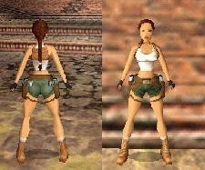
20 Years
by Danilo
by Danilo
Good one
It's a good outfit, you really see she is younger then the original lara but older then the young lara. Making the age visible is not so very easy. Also it's a light coloured outfit which are nice and friendly. But the outfit won't fit in levels with hard action and lots of killing.
(13 Mar 2004 22:38)

Condition Zero GSG 9
by Silent Viper
by Silent Viper
Again great
Not much to say about all of these new SAS enemies, they are all great. Nice texturing and nice meshes. To bad there is only 1 sas slot cause it would be nice to put more of these in your level.
(13 Mar 2004 22:27)
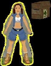
New Lara Young
by Mathieu
by Mathieu
Nice
The outfit looks nice on Lara, but it does not seems much difference then the original one. Textures looked very well and combination of colors was also nice.
(13 Mar 2004 22:25)
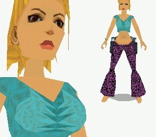
Flower Power
by Golden Dawn
by Golden Dawn
Wow!
This is a great outfit! The textures seems to be mapped all correctly and it has some great meshes. Only problem is when you light a flare there is a stange link between the hands. You also need a new hand mesh for the flares included to avoid this.
(13 Mar 2004 22:06)
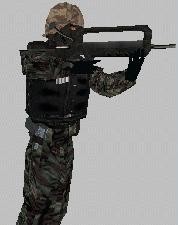
Condition Zero GSG 9
by Silent Viper
by Silent Viper
Great!
The skin is just great! Nice textures and correctly mapped. Also a great gun, only don't make him fire gernades! Place some AI objects under him so he won't fire them cause that does not look so well if he does.
(13 Mar 2004 22:00)
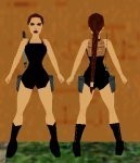
Blair Witch 2 Outfit
by Netslider
by Netslider
Bad textures
The textures, if you can even call them so, are very bad. It is completely black. If you look at reality, you won't find it. Good textures have a small tolerance in the color. If you really need 100% black, you must add a shiny effect to it (not sure if this was available when this outfit was created).
(20 May 2003 03:00)
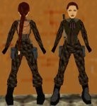
Military Outfit
by Netslider
by Netslider
Light bug
The outfit has nice textures, but the same texture has been used for nearly the complete outfit. Normaly this would cause the outfit to look bad, but because this is a dark outfit, you won't see it. Something that annoyed me was the hard head she had. Even if you were in a room with a lot of lights and flares, it still was dark. There seems to be a bug with the normals which cause the lights not to work on that mesh. Her head looks very flat now, just like when you forgot to place light in a room (but they did exist in my test!).
(20 May 2003 03:00)

blue cat outfit
by noangel
by noangel
Running out of time?
Just wondering. Did you had a dead-line to produce another outfit? Or was this just a test how strpix worked? The outfit is just the original outfit from Lara with a few faces that got another color. Not differend textures, just the color changed. It's not a brand new outfit for lara. I must say that I never liked her original outfit and if I compare this one to the original one, it's better, but still not good.
(20 May 2003 03:00)
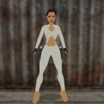
Pajama
by TR_Nut
by TR_Nut
Light bug
The outfit looks great, with nice textures and meshes. But it seems to have some problems with the normals. When I tested it, the light on the lower part of her arms were not the same then the upper part. When the upper part (which looked normal) was dark, the lower part was light. I'm not sure what caused this, but I guess it's the normals.
(20 May 2003 03:00)
Showing 16 to 30 of 80 reviews