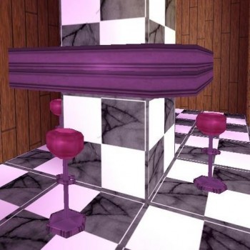
1950's style cafe table and stool by stranger1992
Description
1950's style cafe and stool by Stranger1992.
All meshes by myself. Textures from Usuki Frenzist's beds (https://www.trsearch.org/Items/2788)(recoloured by myself) and other textures by myself.
Please credit the above and enjoy.
Stranger1992 29/1/08
Objects
Object Type
Furniture / Static
Reviews (1)
I was just idly browsing today (as you do) when i came across these. They look really cool! I think I must have been away when they were released because I really don't remember them. It's a shame that objects like these don't have a wider use in the trle world. Originality: 10 Well, there honestly isn't much like this here, and from what I can see you have used some of your own textures and your own meshes. Quality: 8 Well, some of the textures on the bottom don't quite fit, and there are plenty of unnescessary polygons - the table has two rows of faces when only one is needed, doubling the count. Useability: 8 Well, the problem is not many people are building levels involving cities where these could be used (at the moment - but there is a market people!) but i can really picture these in shady clubs like Le Serpent Rouge, run-down backstreet shops in Cairo, old-fashioned apartments etc. so they do have a wide range of locations where they fit. Textures: 8 Like I said before, it's just the fact that some of them don't quite tile as well as one might like. Meshes: 10 The meshes are really good, I love how the table fits round a column, it means they can be used effectively in the space. I knocked a few points off quality for the too-high-polygon count, so I will keep this at a ten :)
(04 Apr 2008 15:57)
5
(0)
4
(1)
3
(0)
2
(0)
1
(0)
Extra Rating
Originality
(1)
Quality
(1)
Meshes
(1)
Not noticed these before!
Originality
Quality
Meshes
I was just idly browsing today (as you do) when i came across these. They look really cool! I think I must have been away when they were released because I really don't remember them. It's a shame that objects like these don't have a wider use in the trle world. Originality: 10 Well, there honestly isn't much like this here, and from what I can see you have used some of your own textures and your own meshes. Quality: 8 Well, some of the textures on the bottom don't quite fit, and there are plenty of unnescessary polygons - the table has two rows of faces when only one is needed, doubling the count. Useability: 8 Well, the problem is not many people are building levels involving cities where these could be used (at the moment - but there is a market people!) but i can really picture these in shady clubs like Le Serpent Rouge, run-down backstreet shops in Cairo, old-fashioned apartments etc. so they do have a wide range of locations where they fit. Textures: 8 Like I said before, it's just the fact that some of them don't quite tile as well as one might like. Meshes: 10 The meshes are really good, I love how the table fits round a column, it means they can be used effectively in the space. I knocked a few points off quality for the too-high-polygon count, so I will keep this at a ten :)
(04 Apr 2008 15:57)
0
0
Add Review
To review this item you have must be logged

