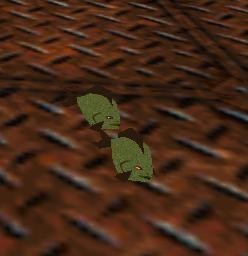
Little fish by teme9
Reviews (2)
Original: I gave 9 cos I've never seen anybody really change the lil beetle into something else. Quality: well it looked ok and the mesh was fine too, textures were a bit lame. Useable: Can probably be used in any level which is based around water... Textures: As I said earlier, a bit lame and the fish skin looked more like a tree leaf :S and few things (like the mouth) should have needed something more maybe, looks so "made with Paint" Meshes: Well done, no holes Animations: Umm, I wasn't sure if whipping the tail was done by you...it was ok, maybe little too fast. Overal: Nice object and if this was your first one, then you have atleast a good start. :) continue your work.
(04 Jul 2005 23:13)
The wad contains a small, bulky, nasty fish for the LITTLE_BEETLE slot. The LITTLE_BEETLE has been modified before (to look like a spider in the Alien level of "Lara at the Movies", for example, or transformed into a really big bug in one of Richard Lawther's levels, and some aeons ago Tomo adapted the TR5 rat swarm to this slot), but not very often, and in all cases that I know of it has remained some kind of creature that lives on dry land. There is a reason for this: As was to be expected, the object under scrutiny never rises up from the floor, which is rather awkward for a fish. Sure, there are species that prefer living near the ground, but if they were so keen on nibbling at Lara as this one here seems to be, one would expect that they overcome their reluctance. The best thing about this object is surely the mesh. It is simply a deformed sphere plus the fins, but that is in fact quite adequate and well done; the textures, on the other hand, are much too large (about half a dozen 64x64 textures are used!) and rather plain at the same time; and, I'm afraid, not really good, too. This is all the more serious because the LITTLE_BEETLE does not seem to be affected by external lighting—which of course isn't the author's fault, but he should have taken the fact into account. The initial idea surely is a nice one, but it's hard for me to imagine a location or situation in a level where you could actually make use of it. [i]Edited by Mulf[/i] [i]Edited by Mulf[/i]
(14 Jan 2006 12:43)
5
(0)
4
(1)
3
(1)
2
(0)
1
(0)
Extra Rating
Originality
(2)
Quality
(2)
Meshes
(2)
Originality
Quality
Meshes
Original: I gave 9 cos I've never seen anybody really change the lil beetle into something else. Quality: well it looked ok and the mesh was fine too, textures were a bit lame. Useable: Can probably be used in any level which is based around water... Textures: As I said earlier, a bit lame and the fish skin looked more like a tree leaf :S and few things (like the mouth) should have needed something more maybe, looks so "made with Paint" Meshes: Well done, no holes Animations: Umm, I wasn't sure if whipping the tail was done by you...it was ok, maybe little too fast. Overal: Nice object and if this was your first one, then you have atleast a good start. :) continue your work.
(04 Jul 2005 23:13)
Author Reply
Thank you!
Thank you!
0
0
[untitled]
Originality
Quality
Meshes
The wad contains a small, bulky, nasty fish for the LITTLE_BEETLE slot. The LITTLE_BEETLE has been modified before (to look like a spider in the Alien level of "Lara at the Movies", for example, or transformed into a really big bug in one of Richard Lawther's levels, and some aeons ago Tomo adapted the TR5 rat swarm to this slot), but not very often, and in all cases that I know of it has remained some kind of creature that lives on dry land. There is a reason for this: As was to be expected, the object under scrutiny never rises up from the floor, which is rather awkward for a fish. Sure, there are species that prefer living near the ground, but if they were so keen on nibbling at Lara as this one here seems to be, one would expect that they overcome their reluctance. The best thing about this object is surely the mesh. It is simply a deformed sphere plus the fins, but that is in fact quite adequate and well done; the textures, on the other hand, are much too large (about half a dozen 64x64 textures are used!) and rather plain at the same time; and, I'm afraid, not really good, too. This is all the more serious because the LITTLE_BEETLE does not seem to be affected by external lighting—which of course isn't the author's fault, but he should have taken the fact into account. The initial idea surely is a nice one, but it's hard for me to imagine a location or situation in a level where you could actually make use of it. [i]Edited by Mulf[/i] [i]Edited by Mulf[/i]
(14 Jan 2006 12:43)
Author Reply
Thank you!
Thank you!
0
0
Add Review
To review this item you have must be logged


