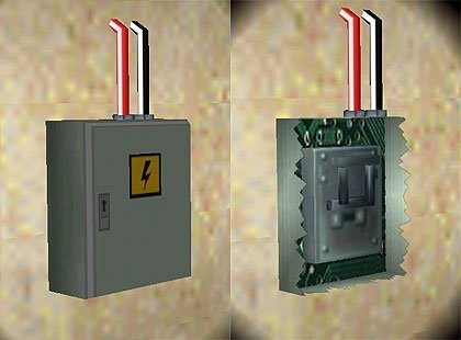
Electricity box by karlo002
Description
A switch, based on the small TR3-Switch, but with a shatterable console. Read the instructions! :-)
Objects
Object Type
Doors & switches
Reviews (3)
I absolutely love this item. It's a simple design, easy to use (i hate having to have lots of complicated OCB and setup requirements) but it is very effective. The breakdown: Originality: 10 We have very few new switches as it is, and this one, with its beautiful wires and sharp (i'll come to this in a minute) console, certainly has some sort of an edge over the others. Quality: 10 It's all so lovely! The wires, as i've said before, are a nice touch. You can't see the switch through the casing, and the switch can't be pulled while the casing is still there. Perfect! Useability: 7 Well... I can't really see it in a temple, can you? And seeing it in a jungle would also look funny. However, because of it looking so good everywhere else, i didn't want to give too low a rating here. Textures: 10 Ah, the 'sharp' business. What i mean is, when people try to replicate logos, like the little lightning on the casing, they usually turn out a bit blurry. Yours doesn't! This is quite an achievment. The textures certainly look metallic, and i love the circuits around the switch. Well done! Meshes: 10 I never give a low rating for simple meshes if it's a simple object, but i never give a ten either. This is only a ten because of those fabulous little touches: the wires (they really are nice!) coming out of the box, the jagged edges jutting out when you shoot the box. (many people would just leave those edges blank, but you didn't at it looks really realistic) It's just the little things that make all the difference. A job well done!
(06 May 2006 10:22)
Had seen this in other levels and wanted it: plus I second everything that ahs been written in the review before me! Thanks.
(18 Dec 2022 02:19)
Very helpful
(11 Dec 2024 21:18)
5
(3)
4
(0)
3
(0)
2
(0)
1
(0)
Extra Rating
Originality
(2)
Quality
(2)
Meshes
(2)
A great job!
Originality
Quality
Meshes
I absolutely love this item. It's a simple design, easy to use (i hate having to have lots of complicated OCB and setup requirements) but it is very effective. The breakdown: Originality: 10 We have very few new switches as it is, and this one, with its beautiful wires and sharp (i'll come to this in a minute) console, certainly has some sort of an edge over the others. Quality: 10 It's all so lovely! The wires, as i've said before, are a nice touch. You can't see the switch through the casing, and the switch can't be pulled while the casing is still there. Perfect! Useability: 7 Well... I can't really see it in a temple, can you? And seeing it in a jungle would also look funny. However, because of it looking so good everywhere else, i didn't want to give too low a rating here. Textures: 10 Ah, the 'sharp' business. What i mean is, when people try to replicate logos, like the little lightning on the casing, they usually turn out a bit blurry. Yours doesn't! This is quite an achievment. The textures certainly look metallic, and i love the circuits around the switch. Well done! Meshes: 10 I never give a low rating for simple meshes if it's a simple object, but i never give a ten either. This is only a ten because of those fabulous little touches: the wires (they really are nice!) coming out of the box, the jagged edges jutting out when you shoot the box. (many people would just leave those edges blank, but you didn't at it looks really realistic) It's just the little things that make all the difference. A job well done!
(06 May 2006 10:22)
0
0
Found it!
Had seen this in other levels and wanted it: plus I second everything that ahs been written in the review before me! Thanks.
(18 Dec 2022 02:19)
0
0
Perfect!
Originality
Quality
Meshes
Very helpful
(11 Dec 2024 21:18)
0
0
Add Review
To review this item you have must be logged


