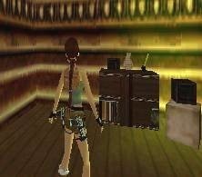
Desk/shelf by Johnny
Description
This is my first object ever! It is only a static object (I thoought I should start with something easy), and it uses a lot of polygons, but less than 255. Everything done by me.
Objects
Object Type
Furniture / Static
Reviews (1)
Origanal: We already have some desks, but this one is really something new. It really has it's own style Quality: Although it looks good in strpix, in-game I noticed some problems: 1. For statics, the point 0,0,0 is on the middle of the square on the floor. Because of the positioning of your object, It appears to be buried in the floor. 2. The second object was very strange. I don't know if it's meant to be semi-transperant, but it looks kinda odd to me. It doesn't have collision and it's on its side, probably caused by wrong outputting of the dxf (forgot to swap YZ) Useable: Mainly for mansion levels. Textures: Textures were good, although I noticed a few untextured polygons. Meshes: Meshes were good and very they had very much polygons. The bookcases below the desk could be deeper so it would be more 3D. I noticed some little holes because the polygons sometimes didn't fit to each other. It's barely visible in-game, but it is in strpix. A good object, but with some flaws. The best way to get around them is to test your objects in-game. Just keep making objects and you'll learn how to avoid those nasty bugs.
(26 Jan 2005 17:07)
5
(0)
4
(1)
3
(0)
2
(0)
1
(0)
Extra Rating
Originality
(1)
Quality
(1)
Meshes
(1)
A good first object, keep on making even better ones!
Originality
Quality
Meshes
Origanal: We already have some desks, but this one is really something new. It really has it's own style Quality: Although it looks good in strpix, in-game I noticed some problems: 1. For statics, the point 0,0,0 is on the middle of the square on the floor. Because of the positioning of your object, It appears to be buried in the floor. 2. The second object was very strange. I don't know if it's meant to be semi-transperant, but it looks kinda odd to me. It doesn't have collision and it's on its side, probably caused by wrong outputting of the dxf (forgot to swap YZ) Useable: Mainly for mansion levels. Textures: Textures were good, although I noticed a few untextured polygons. Meshes: Meshes were good and very they had very much polygons. The bookcases below the desk could be deeper so it would be more 3D. I noticed some little holes because the polygons sometimes didn't fit to each other. It's barely visible in-game, but it is in strpix. A good object, but with some flaws. The best way to get around them is to test your objects in-game. Just keep making objects and you'll learn how to avoid those nasty bugs.
(26 Jan 2005 17:07)
0
0
Add Review
To review this item you have must be logged

