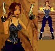
Basic Blue Ver. II by C/y
Description
This is the second version of the Basic Blue outfit, no it's not a remake of the old one, just a second blue outfit ;-) It took about 6 hours and it features a new "shooting head" created by me. Lara wears a blue top and blue pants. Her hair is red, I think this is just something different ;-) I hope you enjoy the outfit, Happy Raiding =)
Outfits
Categories
Summer / Seasons
Reviews (1)
Original: The style of the shirt and pants have been used in previous outfits by this author, shoes are aod stlye and the color choice wasnt completly original. Quality: The neck is connected to the chest, witch sometimes can be seen. It also doesnt look as good when in brighter lighting. And when on the subject of lighting, there were some odd lighting probs on the outfit. Nothing huge, just minor ones here and there. Useable: It can be used in the city, or a home level. Custom textures: The shirt looks a little bit Sparkly/flashy in game, witch can be a bit hard on the eyes. But the texture it's self in stripx is fine. The pants texture is not a plain color, but it's very close to being plain. The hair looks great in dark lighting, but when it is in very bright lighting her hair looks a bit unrealisticly red. Custom meshes: Head- She looks a bit sad in the face in some angles. Something looks odd in the shape of the face but I can't quite pin point what it is. The bands were really well made though, I liked how high poly they are. Chest- It's been used in another outfit already but that doesnt really matter. The neck is connected to the chest but it's the only joint that is connected. The shirt is a bit 3d, but the inside of the shirt has no polygon face so is disapears. Not a problem though because I don't think you can see that ingame. Pants- They are well made, lots of polys. But it doesnt look very realistic, as it looks as if the pants had been filled with something lumpy. ---- I wish I had more positive things to say, but the outfit could use some work still, mainly in the details. I still like it though, and it is good, I'd like to see it in a level sometime. ;)
(24 Jan 2005 03:17)
5
(0)
4
(1)
3
(0)
2
(0)
1
(0)
Extra Rating
Originality
(1)
Useability
(1)
Quality
(1)
Meshes
(1)
Animations
(0)
Originality
Useability
Quality
Meshes
Original: The style of the shirt and pants have been used in previous outfits by this author, shoes are aod stlye and the color choice wasnt completly original. Quality: The neck is connected to the chest, witch sometimes can be seen. It also doesnt look as good when in brighter lighting. And when on the subject of lighting, there were some odd lighting probs on the outfit. Nothing huge, just minor ones here and there. Useable: It can be used in the city, or a home level. Custom textures: The shirt looks a little bit Sparkly/flashy in game, witch can be a bit hard on the eyes. But the texture it's self in stripx is fine. The pants texture is not a plain color, but it's very close to being plain. The hair looks great in dark lighting, but when it is in very bright lighting her hair looks a bit unrealisticly red. Custom meshes: Head- She looks a bit sad in the face in some angles. Something looks odd in the shape of the face but I can't quite pin point what it is. The bands were really well made though, I liked how high poly they are. Chest- It's been used in another outfit already but that doesnt really matter. The neck is connected to the chest but it's the only joint that is connected. The shirt is a bit 3d, but the inside of the shirt has no polygon face so is disapears. Not a problem though because I don't think you can see that ingame. Pants- They are well made, lots of polys. But it doesnt look very realistic, as it looks as if the pants had been filled with something lumpy. ---- I wish I had more positive things to say, but the outfit could use some work still, mainly in the details. I still like it though, and it is good, I'd like to see it in a level sometime. ;)
(24 Jan 2005 03:17)
0
0
Add Review
To review this item you have must be logged

