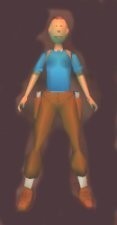
Tintin by Mathieu
Reviews (3)
humm, this outfit is really strange and not good, the head mesh is round, the torso is simple, the texures are poor. its outfit could be a great outfit with better textures and meshes, but the idea is cool, thats why I gave 8 to the originality
(12 Apr 2004 18:12)
This outfit is quite comical. The meshes wern't all that good, mainly because of the head. It's just a streched sphere with a smaller sphere, supossedly representing a nose. A drawn on face and mouth looked more than cheesy, which made me laugh. The rest of the textures were flat with nothing to them.
(20 Apr 2004 02:52)
I hate giving away bad reviews. But on this one, I have to. First of all, only the Lara_Skin, Lara_Skin_Joints and the Lara_Scream objects were included, which was a big mistake, and caused the huge downfall of the outfit, when it's a totally new character, not to mention a male character. At least a transparent hair could have been included, and because of the hands, gun animations were vital too. Next: the meshes. Simple, but did a fair job in keeping the character together, and no bugs with the neck and other joints. Next: the textures. TOO plain, only single or double colour textures, and awful detail textures. Even though this is a comic character, it NEEDS better textures than that. The useability is at a low, but the originality on a high top. Nice idea, but poorly performed.
(24 Apr 2004 22:54)
5
(0)
4
(0)
3
(2)
2
(1)
1
(0)
Extra Rating
Originality
(3)
Useability
(3)
Quality
(3)
Meshes
(3)
Animations
(0)
Originality
Useability
Quality
Meshes
humm, this outfit is really strange and not good, the head mesh is round, the torso is simple, the texures are poor. its outfit could be a great outfit with better textures and meshes, but the idea is cool, thats why I gave 8 to the originality
(12 Apr 2004 18:12)
0
0
Tintin
Originality
Useability
Quality
Meshes
This outfit is quite comical. The meshes wern't all that good, mainly because of the head. It's just a streched sphere with a smaller sphere, supossedly representing a nose. A drawn on face and mouth looked more than cheesy, which made me laugh. The rest of the textures were flat with nothing to them.
(20 Apr 2004 02:52)
0
0
Sorry, but this outfit was failed.
Originality
Useability
Quality
Meshes
I hate giving away bad reviews. But on this one, I have to. First of all, only the Lara_Skin, Lara_Skin_Joints and the Lara_Scream objects were included, which was a big mistake, and caused the huge downfall of the outfit, when it's a totally new character, not to mention a male character. At least a transparent hair could have been included, and because of the hands, gun animations were vital too. Next: the meshes. Simple, but did a fair job in keeping the character together, and no bugs with the neck and other joints. Next: the textures. TOO plain, only single or double colour textures, and awful detail textures. Even though this is a comic character, it NEEDS better textures than that. The useability is at a low, but the originality on a high top. Nice idea, but poorly performed.
(24 Apr 2004 22:54)
0
0
Add Review
To review this item you have must be logged

