
This is a Beta version of trsearch.org, more info in What's New page. Did you found a problem? Please report to info@trsearch.org
Vudu
Interests: All The Good Things
Gender: m
Items
1
1
Reviews
122
122
Follower
0
0
Showing 1 to 15 of 122 reviews
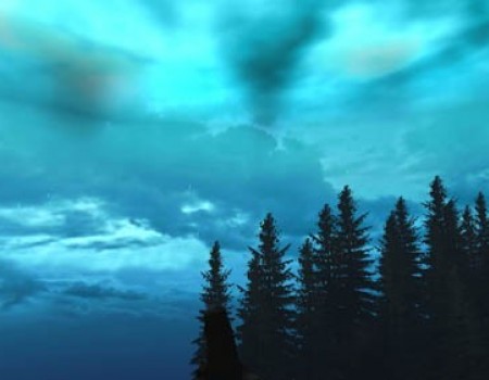
Cloudy Blue Horizon
by teme9
by teme9
Home run!
It really is stunning. It's so original how you put this horizon together. Gorgeous textures, cool mesh. Looks great with rain especially. Imagine if Core had thought of making a horizon like this. Put this in a level and I guarantee players will spend more time on it just to stare at the sky! This IS the best horizon for TRLE on the net, and you'd be hard put to make one better.
(28 Sep 2012 04:19)
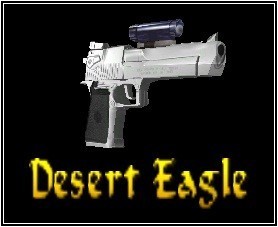
Single Desert Eagle Pack
by DeltaTR
by DeltaTR
Top Notch Weapon
What a beautiful toy. It feels good to hold just like the original from TR3. It deserves a nice powerful gunshot fx to match its impressive and intimidating physique. Quite a gift. Also, it's really admirable that you take the time to make your weapons compatible with all the best outfits on TRSearch. Really beyond the call of duty and so much appreciated. May I ask what combination of programs you use to combine the guns with the hands/holsters?
(24 Sep 2012 23:00)
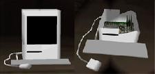
Shatterable computer
by cornchild
by cornchild
Review 129
Well this was a great idea, although I've seen it before. I think the other one was by Justin, not released on the SE, although this one is much higher quality. The meshes and textures though could've been more detailed. Maybe if the keyboard had 3D keys or at least key textures It might have impressed me more. Also I think the CPU could've been more detailed. (where are the buttons? the ports? the vents?) Still better than most other computers I've seen in TRLE, but it could be much better. But what really boosted the rating was that you could have part of the computer actually left after shooting it. Reminds me of the TR3 vents. I think it goes with one of my favorite quotes: The difference between ordinary and extraordinary is that little extra. (which I think can be applied very well to the LE) Anyone can make a simple shatter object, but having an after effect takes extra time and shows attention to detail. While the computer is still a bit too plain, I love the after affect. It's usable in just about every level I can think of, except of course an ancient tomb, so usability is very high. Good job, but maybe a little more detail on the meshes/textures next time? [i]Edited by Vudu[/i]
(25 Aug 2004 21:04)
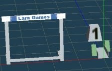
Lara Olympics: Hurdles
by Michiel
by Michiel
Review 128
It's not really as stunning as say, Rene's new fountain but still a nice object. The quality is of course perfect (would be embarrassing for the administrator to release a buggy item). It's not really usable in many levels however. I can imagine it being used for a new exercise/obstacle in Lara's Home, or if someoene wanted to do a level in Athens present day, or maybe just a fun level (Lara in the Olympics). The originality is a 10, for obvious reasons. The textures are very good too, no flaws, look great on the object. Meshes are also high in quality. The only thing I had to rate down was the usability. It's mostly a prop but could be used as an obstacle as stated before. Overall a good object, if only just to add a little something extra to your level.
(25 Aug 2004 20:24)
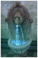
Lion Fountain
by Piega
by Piega
Review 127
I really liked this one, and I would expect no less from Rene. The meshes were perfect, the textures were very good and very realistic (well I never thought the water in Tomb Raider was very realistic, but the stone texture is and the water looks very nice anyways). It's good to see a few objects from the master level builders (Jackie and Rene for example) here on the SE, I hope we get many more from these. This actually looks similar to something In saw in the new Indiana Jones game, but that's got nothing to do with the rating. This can be usable in many different types of environments. This is an object of very high quality, originality, [i]and[/i] usability, which we don't get all too often here. A fine peice of Architecture. Very good job, Rene.
(25 Aug 2004 20:07)
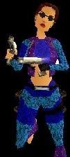
Summer
by joontje
by joontje
Review 126
Well first of all, I don't think it's very original at all. Summer outfits have been done many times before, as have jean outfits. I definitely would not use this in a level. The textures were terrible, although they are more realistic than your other outfit textures. The jean texture was ok, but not really that other texture, whatever it was supposed to be. The textures were badly placed on the whole body, plus the head is ugly. I can't really rate the meshes, since they were taken from other people. Credits are important here if you want to have a good reputation, you should always put them in the description as well as the readme if you have one, since many people don't read the readme. Overall not a very good outfit. I suggest next you take more time to get the textures perfect, instead of just throwing it together like it looks like you did on this one.
(25 Aug 2004 19:47)
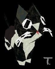
Neo my Kitty
by Trinity
by Trinity
Cute
Certainly a strange looking kitten. lol (no offence) Nicely done, the meshes and textures were good, I was glad the textures actually looked like fur and weren't just black and white. Not very usable, only in house levels. 4 out of 5 stars. ;) Cute. :P Might've been cooler if were animated to make it breath.
(18 Aug 2004 02:00)
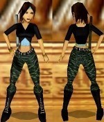
Basic Black
by C/y
by C/y
Review
I really don't see the point in writing such long reviews, cuz I always skip reading those unless they're the onl review available. Meshes and textures are great! A great casual outfit, though I've never been a big fan of casual outfits. Works well in city levels. (though whenever I build a level, I like to use laras original hair, it just doesn't feel right getting rid of her ponytail) Good job, keep up the good work. Though it's not really [i]that[/i] original. Classic outfits similar to this one have been done before. Still good though.
(18 Aug 2004 01:53)
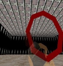
The Rings
by kookee_1223
by kookee_1223
Ok...
Hmmm...well I could imagine this being used in some levels. It's realy nothing special, the mesh is good, and the textures are a bit plain. Though the quality just isn't very high. What's the word I'm looking for to describe this, maybe mediocre. Better luck next time.
(18 Aug 2004 01:39)
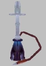
Shisha Waterpipe
by Silent Viper
by Silent Viper
Review
Interesting. Not very usable. The textures i thought could've been a little better. The meshes were great. I can see this being used in a mid east deset level. Where the hell does the water come out though? lol I give it 4 out of 5 stars.
(18 Aug 2004 01:30)
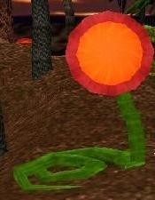
carnivorous plant
by lara-carter
by lara-carter
I always wanted one of these!
I though of making one of these a while ago, though I pictures it quite differetly. For one thing, I think it should have been planted in the ground, it would make more sense that way. The textures, meshes, animation and everything are good, though most of em weren't made by you. :P Still cool and it would be good for a jungle or biodome type environment, or something similar. Cool.
(18 Aug 2004 01:16)
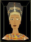
Nofretete
by Golden Dawn
by Golden Dawn
Is it just me?
Hmm for some reason I just don't like this very much. The textues are well done and the meshes too, but it's just not that appealing to me. Usable of course only in Egyptian levels. Nice for maybe on top of a doorway or something. It's ok, but I probably wouldn't use it in one of my levels.
(18 Aug 2004 00:47)
Galery
by Golden Dawn
by Golden Dawn
Good idea!
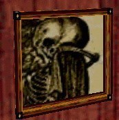
This was a great idea, but would've been better if maybe some bigger frames were incuded. The meshes and textures are well done, the idea was very original, it's usable pretty much everywhere. This is great for poeple to make their own pictures easily. Very good. The pictures already done were good as well. ;) [i]Edited by Vudu[/i]
(18 Aug 2004 00:35)
Ganzir
by Golden Dawn
by Golden Dawn
Nice textures
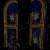
Very cool. The meshes aren't new but the textures are very good. This is great for Babylonian and Egyptian type levels. Originality isn't too high cuz it's just a door with cool textures on it. I couldn't see this being used in a high tech level but it would fit in just about any other kind of level.
(17 Aug 2004 23:20)

Purple Bunny Suit v.1
by dannyx_nr
by dannyx_nr
Hmm...Don't Like : (
Unfortuate for you I don't like the color purple. :P But seriously, there are already 2 of these outfit, the meshes still haven' changed, only the color. The meshes are still well done, the textures are still a little too plain, and it's still not usable. If I were you I would make this the last outfit in this outfit line, but it's up to you. I have spoken. :D
(16 Aug 2004 04:47)
Showing 1 to 15 of 122 reviews