
This is a Beta version of trsearch.org, more info in What's New page. Did you found a problem? Please report to info@trsearch.org
Raiderfan
Interests: Levelbuilding;), Flash
Gender: m
Items
10
10
Reviews
13
13
Follower
0
0
Showing 1 to 13 of 13 reviews
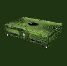
Xbox
by chelle
by chelle
10+!
Original: I have never seen anything like this before! Very good idea to make one Useable: Perhaps for home levels, but especially 4 fun levels. Quality: I couldn't find any bug, very well done Textures: They were amazying! How did you make them??? Only the paws (is that the right word) could be a little bit better. You did a very good job! Meshes: They were just like a real xbox, like a cube. Simple but well done. Very good object. If I would be building a level I would certainly use it. The fact that this xbox is your first object makes it even more special.
(17 May 2005 16:35)

Chess Set
by dhama
by dhama
Playing chess on the SE? You name it, dhama does it!
Original: I believe this is the first set of chess pieces on the SE. So I can give you a full mark. Quality: I found two little problems: 1. There's a strange row of faces on the rook. You can see them when you zoom in from the bottom. As you probably forget to texture them it can give strange results in-game. But it's not a big deal. 2. Import settings. You should add a readme with the correct import settings. Now it's just trial and error Useable: Home levels, or a 'chess' level perhaps. I think the best way of using them is to make them pushable. I think it would be nice to make a chess board where the player needs to do the final move, or something like that. Meshes: They were very nice and realistic. You certainly did a great job.
(20 Mar 2005 09:36)
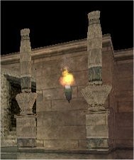
Collums
by -TRANGEL-
by -TRANGEL-
Your second object, very good.
Original: No reason to downrate here, they are nice replacements for the boring catacomb collums. Quality: The arch had wrong collision and visibility boxes, and some textures could be better rotated. But apart from that, it's ok. Useable: Very useable in catacomb style levels. Textures: AOD - they were good. Meshes: Very good, no holes or bugs. I reviewed your first object, the windows, too. Your objects keep getting better! Keep building and releasing!
(14 Feb 2005 19:48)
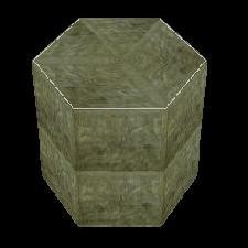
Green pedestal
by Sorata
by Sorata
Nice, but could be better
Original: I haven't seen much pedestals before, but this one doesn't really gives something new. It lacks a bit of style. Quality: No holes or bugs, but the textures could be rotated better. Useable: I think this can be used in a lot of levels. It isn't really special, but it's natural look makes it quite useable. Textures: There was actually just one texture, the second had a white line but was practiacally the same. They could be more detailed. That white line, why did you added it? I think it doesn't make the object more beautiful. A retextured version of the pedestal from tut1.was. It is nice, but it could be much better if you leave out the white line and rotate the textures better.
(06 Feb 2005 10:30)
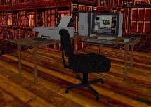
Computer Work Station
by trplayer
by trplayer
The best PC ever!
Original: The first good modern pc for TRLE. Nice detail: winroomedit screenshot on the monitor Useable: Labs, Offices and perhaps in Lara's Home Quality: A little hole on the under side of the wooden bit. Not really noticeable, and I won't downrate for it. Textures: Amazing detailed! They take about a whole texture page. Very well done. Meshes: Good, no bugs and very highpoly. Not really much to say about it. Very good object, much better than the old one. Really worth a five-star rating
(27 Jan 2005 17:05)
Desk/shelf
by Johnny
by Johnny
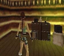
A good first object, keep on making even better ones!
Origanal: We already have some desks, but this one is really something new. It really has it's own style Quality: Although it looks good in strpix, in-game I noticed some problems: 1. For statics, the point 0,0,0 is on the middle of the square on the floor. Because of the positioning of your object, It appears to be buried in the floor. 2. The second object was very strange. I don't know if it's meant to be semi-transperant, but it looks kinda odd to me. It doesn't have collision and it's on its side, probably caused by wrong outputting of the dxf (forgot to swap YZ) Useable: Mainly for mansion levels. Textures: Textures were good, although I noticed a few untextured polygons. Meshes: Meshes were good and very they had very much polygons. The bookcases below the desk could be deeper so it would be more 3D. I noticed some little holes because the polygons sometimes didn't fit to each other. It's barely visible in-game, but it is in strpix. A good object, but with some flaws. The best way to get around them is to test your objects in-game. Just keep making objects and you'll learn how to avoid those nasty bugs.
(26 Jan 2005 17:07)
Greek Temple
by Mathieu
by Mathieu
Good,
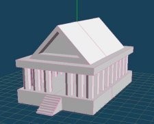
Original: The first temple mesh I've ever seen for the TRLE. Useable: Only as background object in Greek levels. You can't move the object much closer to Lara because the TRLE object size has it's limits. And it has to be split in 3 meshes because of the vertices limit. Quality: I found no holes or bugs in it. But you should either include a .mqo file or explain in the readme how to import it in meta. Now it takes a while just to find the correct import settings. Meshes: The first appearance is good. But when I took a closer look at it, some things looked kinda strange. Esspecially these three things: 1. The roof. This roof is much too steep. And the slope should start at the edge, there should be no flat spot. I think you'll know what I mean, but if you don't, pm me. 2. The interior. a Greek temple isn't an empty thing. There are a couple of rooms in the center, usually three. 3. The pillars. They should be much thinner. The distance between the pillars should be equal, no big gap at the entrance. And you could make more pillars on the side, and make the temple a little longer. It might sound like this is a really bad object, but it really isn't. All things I mentioned are quite easy fixes. I think it takes between 15 and 30 minutes to fix them all. I hope you'll update this object, but it's not absolutely neccesarry. It just makes the object even better.
(15 Jan 2005 18:12)
Windows
by -TRANGEL-
by -TRANGEL-
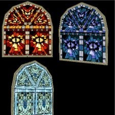
A great invention to look through a wall....a window
Original: The first windows on the SE. So a 10 Quality: I found no bugs or holes, but the textures on the upper part of the windows could be rotated better. Useable: Mainly for church levels Textures: They were good, although I believe I've seen that light-blue texture before. But for the upper parts of the windows you should either rotate/mirror the textures better (as I said before) or make some new textures that fit better. But that's a minor thing, the overall appearance is still very good. Meshes: Simple, but they were good enough A very nice object. It's almost impossible to make a church level without this windows. Just a suggestion: you could add some light shafts for a more realistic effect.
(11 Jan 2005 17:53)

Silvester pack
by Squidward
by Squidward
Original: I suggested this a few days ago, but it's the first TRLE firework I've ever seen. Qualiy: Unfortunatly, there were no sounds included (of course, you should have fun instead of walking around with a microphone to record thm;) but it removes some of the effect. It didn't explode high in the air either. Some objects had bad meshes or missing textures. Useable: only 4joke levels Textures: Were they done in paint?? They were too simple. I spotted two 64x64 plain textures. A 1x1 texture looks the same but reduces wadsize. And wood isn't plain brown. Try www.grsites.com for good wood textures. Meshes: They were good, not much to say about it. Animations:could be more detailed, but were good enough A nice object for a joke level, but I don't think it will be used in a serious level. Both useability and quality aren't just good enough.
(01 Jan 2005 21:11)

Target Switch
by Rainbow
by Rainbow
A bit disappointing
Original: A couple of days ago I released a shatterable target, so this is low original. Especially because it's from TR3. But in Wadmerger I saw you made some original animations. I'll give you a 7. Quality: Unfortunatly, This is a buggy item. I tested it with the revolver+lasersight and when I aim at the top bit, it shatters. But the lower two bits remain standing, even when you shoot at them. The item has no collision, you can walk through it. And it needs to be triggered. That gives a nice effect, but you should mention it in a readme. I figured it out, but I can imagine that some people don't find that solution. I didn't saw anything of the beautiful anims I saw in Wadmerger. Useable: Home and Millitary levels Textures and meshes: I believe they came straight from TR3. They were okay, but you could make them a little more detailed. Animations: They were beautiful. You should just make them visible in-game. This is quite a nice item, but it really needs to be debugged. I hope to see an update soon.
(28 Dec 2004 20:40)

Earth
by Danilo
by Danilo
The Earth, our planet...
Originality: We have some planets, the moon, but this is the first time we have our own earth on the SE. Because the earth was the missing-thing in the planet/space series, I almost expected to see it sometime on the SE. So I gave you a 9. Quality: I found no bugs or holes. The only bad thing is that when you place it, it's buried in the floor. But in space level there is no floor beneath the earth, so you won't lose any points. Useable: It's only useable in space levels, but for that purpose, it's just amazing! Textures: The textures were awesome!!! Except that the edge of the north pole stopped immediatly instead of a smooth transition. Meshes: Seen from the side, they looked brilliant. But when seen from above, it looks octagonal. Perhaps you should change meta's default setting (8) into 12. Then it looks much better After all, This item is not perfect, but you can't make a space level without it. Thanx @ Danilo
(27 Dec 2004 15:42)

Car Race Wad
by TifaNazah
by TifaNazah
Originality: This is the first racewad on the SE. It's very original, so it deserves a full mark Quality: Everything worked fine except the collision boxes of the diagonal boards with red arrows. They are way out of range. I think there is a solution, but it's quite complicated. If you're interested I'll PM or mail it to you. Usable: I think you can fit it into much more places than racetracks. For example: a street race within a city which Lara has to win to proceed in the level. But of course, it can't be used in tombs or temples. Textures: They were nice, but they could use a little more detail. Meshes: The meshes could be better. They were too simple, and a lot of things were paper thin. Now I think it looks like you worked hard on your textures and didn't took your time to make good meshes.
(21 Dec 2004 18:10)
PC
by trplayer
by trplayer
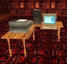
A nice one
Originality: It was (i think) the first computer on the SE, so it deserves a high rating Useable: It's useable in mansions,offices and high-tech levels Quality: I found no bugs or holes. But it didn't looked very modern. Textures: The textures were pretty good. Some looked stretched in Strpix, but it wasn't noticeable in-game. Meshes: The meshes were good, but too simple. Esspecially the printer was blocky
(03 Dec 2004 20:03)
Showing 1 to 13 of 13 reviews