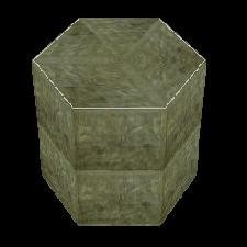
Green pedestal by Sorata
Description
A pedestal from my current project. It fits well with the gothic design but also in tombs from the european region. It fits also well in every other level.
Objects
Object Type
Furniture / Static
Reviews (2)
Original: I haven't seen much pedestals before, but this one doesn't really gives something new. It lacks a bit of style. Quality: No holes or bugs, but the textures could be rotated better. Useable: I think this can be used in a lot of levels. It isn't really special, but it's natural look makes it quite useable. Textures: There was actually just one texture, the second had a white line but was practiacally the same. They could be more detailed. That white line, why did you added it? I think it doesn't make the object more beautiful. A retextured version of the pedestal from tut1.was. It is nice, but it could be much better if you leave out the white line and rotate the textures better.
(06 Feb 2005 10:30)
This pedestal is cool, but could be better. Original: There aren't much pedestal in SE, but this one is from tut1.wad. Quality: AMAZING: deserves a ten Useable: Fits better in european levels, but it's still ok in some tomb raiding Textures: I won't say that they are bad, because they aren't. But they dont have that special "it", that thing that makes an object special. Meshes: From tut1.wad... i won't rate it It's a nice job for your first object. Keep makig objects! I'm using that in my level!
(19 Mar 2005 18:23)
5
(0)
4
(2)
3
(0)
2
(0)
1
(0)
Extra Rating
Originality
(2)
Quality
(2)
Meshes
(0)
Nice, but could be better
Originality
Quality
Original: I haven't seen much pedestals before, but this one doesn't really gives something new. It lacks a bit of style. Quality: No holes or bugs, but the textures could be rotated better. Useable: I think this can be used in a lot of levels. It isn't really special, but it's natural look makes it quite useable. Textures: There was actually just one texture, the second had a white line but was practiacally the same. They could be more detailed. That white line, why did you added it? I think it doesn't make the object more beautiful. A retextured version of the pedestal from tut1.was. It is nice, but it could be much better if you leave out the white line and rotate the textures better.
(06 Feb 2005 10:30)
Author Reply
You are right. I've just used one texture and changed the second one a bit. I added the white line to make it look better. This is my first object I've ever created, so I think it's not the badest object . Thank you for your review and downloading it!
You are right. I've just used one texture and changed the second one a bit. I added the white line to make it look better. This is my first object I've ever created, so I think it's not the badest object . Thank you for your review and downloading it!
0
0
Nice job
Originality
Quality
This pedestal is cool, but could be better. Original: There aren't much pedestal in SE, but this one is from tut1.wad. Quality: AMAZING: deserves a ten Useable: Fits better in european levels, but it's still ok in some tomb raiding Textures: I won't say that they are bad, because they aren't. But they dont have that special "it", that thing that makes an object special. Meshes: From tut1.wad... i won't rate it It's a nice job for your first object. Keep makig objects! I'm using that in my level!
(19 Mar 2005 18:23)
Author Reply
Thank you for your review. I'm glad that you like it and I hope that everybody will enjoy it! So thanks again!
Thank you for your review. I'm glad that you like it and I hope that everybody will enjoy it! So thanks again!
0
0
Add Review
To review this item you have must be logged


