
This is a Beta version of trsearch.org, more info in What's New page. Did you found a problem? Please report to info@trsearch.org
TR_Nut
Interests: Tomb Raider, Vollyball, and Webpage designing.
Gender: m
Items
36
36
Reviews
160
160
Follower
0
0
Showing 91 to 105 of 160 reviews
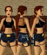
New Generation - Basic
by Danilo
by Danilo
The headmesh was nice lips and all. They could have used a little alteration, but nothing major at all. The rest of the outfit seemed a little too basic, but this is definatly a better outfit that several that are around.
(03 Apr 2004 04:04)
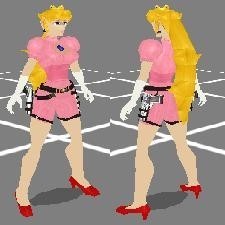
Princess Peach Toadstool
by MrNiceGuy
by MrNiceGuy
Princess Peach Toadstool
It's hillarious, but in a very good way. I don't think that it'll ever get used in a level, but it's entertaining to me as a fellow outfit creator. Meshes are excellent, textures are amazing, the ponytail is just awesome, and it looks almost exactly like peach. The face needed to be a little rounder, but other than than, it was fine.
(31 Mar 2004 22:32)

TR1 Violet
by karlo002
by karlo002
TR1 Violet by karlo002
While I dn't mind the occasional TR1 outfit, creating several of them starts to get annoying.
(30 Mar 2004 06:44)

TR1 White/Green
by karlo002
by karlo002
TR1 White/Green by karlo002
While I dn't mind the occasional TR1 outfit, creating several of them starts to get annoying.
(30 Mar 2004 06:43)
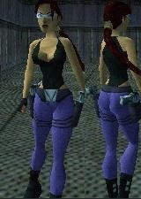
jeans 2
by Danilo
by Danilo
Jeans 2 by Danilo
The headmesh wasn't anything special; a simple hair bit and sunglasses doesn't impress me much. The textures, while a step up from being pain didn't impress me either. The design on the leg didn't convince me for a second that they could be pockets. The previous might sound harsh, but I expect a lot from any outfits that I use.
(30 Mar 2004 06:36)
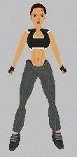
TR1 House Lara
by Mathieu
by Mathieu
Lara TR1 by Mathieu
There are already a couple of TR1 outfits just south of this one, and this one isn't better than them. The worst of all is the eyes. They look really bad on this particular model. Why not go hi-poly instead of reinventing the wheel.... even after someone just reinvented it very recently.
(30 Mar 2004 06:27)
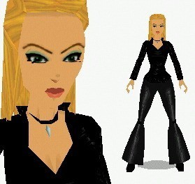
Sophia Leigh *UPDATE*
by Golden Dawn
by Golden Dawn
A lot of bugs in this outfit. For one, most of the weapons that Lara draws cause joint problems. Second, when she draws her pistol and eagle, her one hand has a glove on while the other doesn't. Also sometimes like the shotgun, for example, the finger nails from her right hand disappear. In the inventory, the pistols item is replaced by two desert eagles, but yet, she only draws one with a pistol. Many bugs, but still a cool outfit.
(30 Mar 2004 06:15)
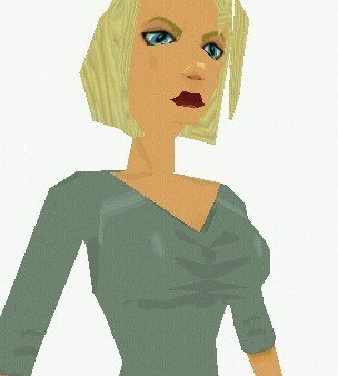
Jaqueline Natla
by Golden Dawn
by Golden Dawn
Like it was said before, the leg texture was great, but the line down them seemed a little too dark. The head mesh seemed a little on the big side, but that may have just been me.
(30 Mar 2004 06:11)

Indis
by Golden Dawn
by Golden Dawn
I really couldn't see this being used in a whole lot of levels, mainly because it doesn't have that certain feel to it. It was a little to plain and needed something more. Maybe something like a pattern at the hem of the shirt/mini skirt and the tribe logo on it. It could have been much better if more time was invested in it.
(30 Mar 2004 06:07)

Ruins
by karlo002
by karlo002
The horizon looks really cool in game except for the fact that half of it was mirrored, giving it a slightly weird look. It was more noticable on this horizon mostly because of how the sun's rays would affect lighting on the ruins.
(17 Mar 2004 20:10)

Quebec City
by karlo002
by karlo002
The horizon looks really cool in game except for the fact that half of it was mirrored, giving it a slightly weird look. It wasn't too noticable which is a good thing.
(17 Mar 2004 20:10)

Shrine
by karlo002
by karlo002
The horizon looks really cool in game except for the fact that half of it was mirrored, giving it a slightly weird look. The sea part of the horizon wasn't as noticable as the opposite side.
(17 Mar 2004 20:08)

Skyline
by karlo002
by karlo002
The horizon looks really cool in game except for the fact that half of it was mirrored, giving it a slightly weird look. It's not that big of a problem though.
(17 Mar 2004 20:03)
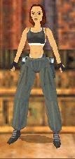
TR1 House Lara with shoos
by karlo002
by karlo002
Other than the fact that Lara has shoes, this outfit is an exact copy of the TR1 House Lara.
(17 Mar 2004 19:19)
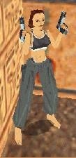
TR1 House Lara
by karlo002
by karlo002
A tr1 beauty. I like that some of these TR1-3 outfits are available for TR4 use. [i]Edited by ChatBot[/i]
(17 Mar 2004 19:17)
Showing 91 to 105 of 160 reviews