
This is a Beta version of trsearch.org, more info in What's New page. Did you found a problem? Please report to info@trsearch.org
TR_Nut
Interests: Tomb Raider, Vollyball, and Webpage designing.
Gender: m
Items
36
36
Reviews
160
160
Follower
0
0
Showing 76 to 90 of 160 reviews
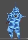
Icey
by TifaNazah
by TifaNazah
Icey
Because it can be taken out in a couple pistol shots, the 'imp' is more usefull for spooking people out than an attacking enemy.
(04 Apr 2004 03:29)
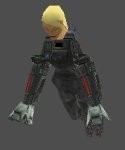
Natla
by cornchild
by cornchild
Natla
This enemy is perfect! The meshes and textures are ace. Cornchild does a good job when creating enemies.
(04 Apr 2004 03:02)
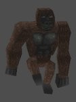
TR1 Gorilla
by Michiel
by Michiel
TR1 Gorilla
The gorilla attacks, but sometimes he doesn't do any damage. Still, he's definatly worth a download.
(04 Apr 2004 02:55)
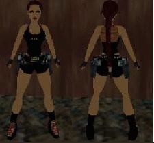
lara goth- him
by vrejusnor
by vrejusnor
lara goth
This outfit scared me -literally. The red eyes are what got to me the most. That and the blood on the shoes. The textures were way to simple, and some of Lara's shorts textures still appear with the black shorts. A lot of the animations and such were missing from the wad. If you use the basic Lara object, you'll be ok, but otherwise, you may want to do some editing first.
(03 Apr 2004 23:56)
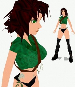
Manga Girl
by Golden Dawn
by Golden Dawn
Puna Queen
Very nice! I simply love the headmesh; it's just purely awesome. The textures are excellent. I ecpecially like the stomach one. Althought this outfit is as good as it is, I don't think that it'll ever make a debut in a level, mostly because it just doesn't fit. If it were and enemy, then it would be a whole different story. *hint hint*
(03 Apr 2004 23:52)
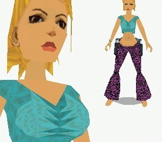
Flower Power
by Golden Dawn
by Golden Dawn
Flower Power
This outfit was fairly decent. The headmesh was really good, but the glasses looked a little to weird not bad, just weird. The pants were good, but the flare could have been a little smoother by adding a couple extra polys. Textures were decent, but nothing too special.
(03 Apr 2004 23:47)

Church Objects
by Timmie_Croft
by Timmie_Croft
Church Objects
Well some of the objects, such as the benches, could have used more polys, but other than that, it's a great starter kit for a church type level.
(03 Apr 2004 07:44)
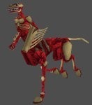
Centaur Mutant v2
by Michiel
by Michiel
I downloaded this object when it was released, but I forgot to post a review on how amazing this enemy is. It works just like in TR1.
(03 Apr 2004 07:37)
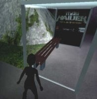
Bus station bench
by Timmie_Croft
by Timmie_Croft
The legs could have been rounder, but other than that, it's perfect.
(03 Apr 2004 07:27)

Guard Tower
by Michiel
by Michiel
It's a little too blocky, but still a good object.
(03 Apr 2004 07:23)

Water Tower
by Michiel
by Michiel
I love how smooth the object looks! It's perfect in my opinoin.
(03 Apr 2004 07:20)
Bench
by Michiel
by Michiel
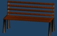
A very nicely constructed bench. It's a great object to give a little more into an outdoor setting.
(03 Apr 2004 07:17)
Desert Rose
by Golden Dawn
by Golden Dawn
Desert Rose
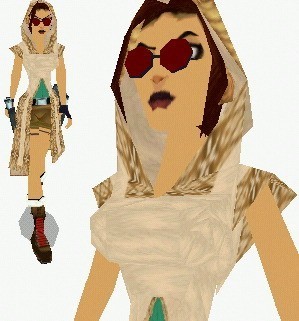
It was a great try at giving Lara a hood, but it wasn't good enough. The glasses made her look, dare I say, 'geeky' by their placement on her face. The textures on the shorts were really messed up, and a list of other things that didn't work correctly.
(03 Apr 2004 04:53)
Kill Bill outfit
by lara-carter
by lara-carter
Kill Bill
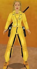
Jaw dropping amazing!! There's not a whole lot I can say, but pure gold! There was one thing that I didn't like, but I understand why it was that way. Most (if not, all) the joints were missing which is a really big pet peeve of mine. It's a little less noticeable, which I give the author credit, but I still noticed them. I am definatly saving this outfit on my hard drive for keeps, and that's saying a lot. There have only been three other outfits that I've thought were of extrordinary skill. One which is Trinity, created by the same author as this one, and the two others by Blind Intentions, Night Angel and Ripped.
(03 Apr 2004 04:48)
New Generation - City
by Danilo
by Danilo
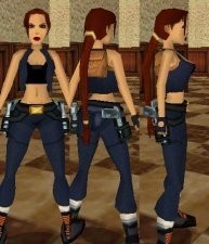
This one is very similar to the last one. Genrally, I strongly dislike repeats, but this one has just enough to keep it fresh. I didn't really like the jacket mesh cause it was extremly blocky and with a few extra polygons, it could have been a lot better.
(03 Apr 2004 04:09)
Showing 76 to 90 of 160 reviews