
This is a Beta version of trsearch.org, more info in What's New page. Did you found a problem? Please report to info@trsearch.org
TR_Nut
Interests: Tomb Raider, Vollyball, and Webpage designing.
Gender: m
Items
36
36
Reviews
160
160
Follower
0
0
Showing 31 to 45 of 160 reviews
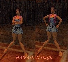
Hawaiian
by kookee_1223
by kookee_1223
Hawaiian
Bugs galore! Several of the joints are messed up, half the Lara files are missing (ie. the pistols, hair, etc.). I believe that the reason the arm joints were messed up had to do with the chest mesh not aligning porperly. Lara's backpack was textured the same as her clothing giving her a 'Hunchback of Nortre Dame' look. Other than that, I loved this outfit. The textures and theme were great.
(05 Jun 2004 04:33)
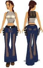
Denim Casual Outfit
by deskj
by deskj
Denim Casual Outfit
This isn't the first outfit that features jeans and a white/grey shirt, but it certainly is the best! The textures were excellent! However, they were a little big making the useability a little lower. The reason I say that is because level designers genrally use a lot of textures for their own objects and level that this would take up quite a bit of space. The meshes were good, but nothing that really stood out making it better than other meshes that look like it.
(04 Jun 2004 20:23)
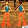
Amici di Maria De Filippi Outfit
by deskj
by deskj
Amici di Maria De Filippi Outfit
This outfit is nice and simple. Usually I don't care for simple outfits but this one is an exception. The pants mesh was a little on the big side and looked strange when Lara was crawling because you could see her legs. If the inside of the pants connected with the botton of her lower leg mesh it would have looked better than at the top.
(03 Jun 2004 23:15)
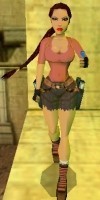
Rose-Red Lara
by C/y
by C/y
Rose-Red
Other than the problem with a couple of the short's textures not being properly placed on the inside of the legs, I didn't notice any bugs with the outfit. The textures were great, but the shorts needed a little better textures.
(03 Jun 2004 23:02)

Camouflage
by C/y
by C/y
Camouflage
This outfit is totaly camouflaged... in the pic anyway. It was brightly textured and would more-so be cammo from the colorblind. Other than the fact that the name doesn't quite match the outfit, the textures were decent, a step up from using the plain colors.
(03 Jun 2004 22:53)
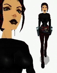
black dragon
by Golden Dawn
by Golden Dawn
Black Dragon
It looks quite similar to the Snake Skin outfit created by the same author.... except I didn't like this one as much. Dont get me wrong, I love this outfit, but the textures were a bit too dark and were hard to notice in a lot of the lighting situations I tested them in.
(03 Jun 2004 22:03)
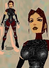
Snakeskin Catsuit
by Golden Dawn
by Golden Dawn
Snakeskin Catsuit
I really liked this outfit. The whole idea worked together, and Golden Dawn pulled it off nicely. I'm glad to see that there are still outfits being made that have originality and quality. The stomach joint was missing, but it's barely noticable.
(03 Jun 2004 22:00)
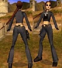
The Punisher
by Devoid
by Devoid
The Punisher
Basically, it looks like an AoD outfit with a skull shirt, which is very well done, and her pants sagging too low. The originality was hard to rate because of it's AoDness, but I guess that the over all idea, the shirt, and the pants, although I didn't care for it at all, gives it a 7. The Quality was good, but the animations for the gun didn't look quite right. Plus the gun doesn't look right at the slant that it is when she's holding it. Antoher thing to note is that the gun should have been in the revolver slot. It just doesn't make sense that it isn't. The usability isn't quite a 10 because I don't think that a whole lot of level creaters will use this for the pants reason.
(03 Jun 2004 21:51)

Gadzook Lara AOD style
by Blind_Intentions
by Blind_Intentions
Gadzook Lara
Although it's like an AoD outfit, at the time this was created, it was completly original. Plus the fact that the author went beyond creating an exact duplicate and made it his own. I absolutely loved the shirt mesh. However, it could have been textured better.
(03 Jun 2004 21:14)

Blue Stars
by C/y
by C/y
Blue Stars
Almost exactly like the previous outfit by this author, it offers only a little bit new. The textures arn't as good and it's decreasing in originality cause it's basically the same thing.
(22 May 2004 01:58)
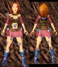
Butterfly Outfit
by lara-carter
by lara-carter
Butterfly Outfit
While this outfit is very original, all the meshes seem to have been used on previous outfits created by this author. I have loved most of the outfits lara-carter creates, but this one disappointed me just a litte bit. It didn't seemd to fit in the eviorments that I tested it in, and the eyes made the face look masculine. They also looked too smal for the face too.
(22 May 2004 01:54)

Blue Dress
by C/y
by C/y
Blue Dress
Everything seemed to work with this outfit. I especially loved the textures. They looked nice and the author applied them in a nice pattern. [i]Edited by TR_Nut[/i]
(22 May 2004 01:47)
Grey-Army
by C/y
by C/y
Grey-Army
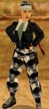
All the joints were taken out of the wad, giving it more of that TR3 feel. Meshes were suitable and the textures could have been better (namely the overused one on the jacket). When swimming, I noticed a pink spot underneath the jacket.
(22 May 2004 01:42)

red comando
by P@trick
by P@trick
red comando
This outfit looks almost exactly like the outfit from the Last Saga 4 less the glasses, except not quite as good. It was decent, but offered nothing spectacular.
(22 May 2004 01:31)
AoD Louvre
by L.Croft
by L.Croft
AoD Louvre
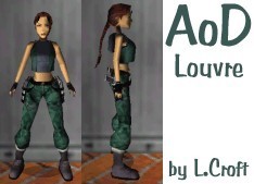
I swear, we are going to have to get a 0 rating for originality put in soon. AoD outfits sicken me! The quality isn't that great, and the meshes offer nothing new. Hair bits, done before. Bunched up pants, seen it.... several times. The textures were ok, but I've seen them before to.
(22 May 2004 01:26)
Showing 31 to 45 of 160 reviews