
This is a Beta version of trsearch.org, more info in What's New page. Did you found a problem? Please report to info@trsearch.org
TR_Nut
Interests: Tomb Raider, Vollyball, and Webpage designing.
Gender: m
Items
36
36
Reviews
160
160
Follower
0
0
Showing 1 to 15 of 160 reviews
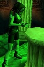
Lara as Setsuna Kaiba
by Kimutaku
by Kimutaku
Stolen items?
That head mesh looks vaguely familiar. Actually it is because I created it. I think that the belt mesh was probably someone else's, but I'm uncertain on who's. I'm sure I'm speaking for most authors when I say this, We would appriciate it if our work is used that proper credit is given. Preferably in the form of a readme in the outfit file. On to the review. Original: There are plenty of same textured black outfits in the database, so there really isn't much originality here. Quality: While most of the outfit was decent, there were a couple things. One, the neck joint gets stretched when firing weapons. The other is, her hands are 3D when running around and that sort, but they revert back to the old block hands method. Useable: Most enviorments it could be used in. Textures: Most textures were all plain and overused. That's ok though if you're a beginer. I was the master at using one tile textures for my outfits. Meshes: Stolen material
(25 Apr 2006 01:26)
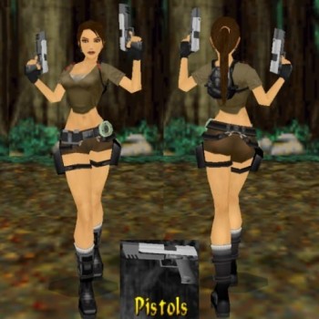
Tomb Raider VII Outfit Remake
by Po Yu
by Po Yu
The art of outfit making
This is a beautifully crafted outfit that deserves the right to enter the hall of fame. The attention to detail in all areas makes this outfit one of the best I've ever played with. You can tell when it's great when I spend over 5 minutes playing with the outfit. I almost didn't want to come back to review it because I enjoyed it so much so, I didn't want to leave. Original: This is probably one of my harshest categories. I'm a real stickler with it, but this one has enough to it that it battles what the creators of Legends created. Quality: The utmost quality! very nicely crafted. Usable: The usability on this outfit has a very wide horizon of possibilities. Custom textures: Beautiful textures! The skin being the most amazing. I really enjoyed how the author created such beautiful textures with relatively small resolutions. Custom meshes: Another one of my most harshest categories. Not much more to say other than, I am amazed. Excellent job! Download this outfit today, you'll be glad you did. If you wasted all this time to read the reviews and don't download it, you are one sad puppy.
(24 Apr 2006 08:15)
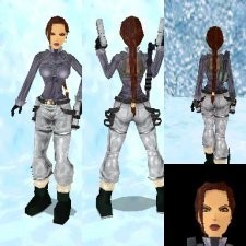
Winter Jacket
by Danilo
by Danilo
Winter Jacket
Originality: It's not 100% original cause it looks quite similar to Miss Croft's Walhalla outfit [colors and theme]. Quality: I didn't find any bugs in the outfit. Useability: It really can only be used in winter levels, but with the quality rating that it has, it can be used in all winter levels. Custom textures: Some of them were a little on the big side and some of the textures on the jacket looked as though they were slapped on. Meshes: The meshes wern't original cause I've seen them being used in several different outfits, but they were decent in quality. [Edit: The reason I say the meshes arn't original is cause I've seen these types of meshes done on several different outfits (ones created by different authors). They didn't have a 'wow' factor to them that made them better more original than others.] [i]Edited by TR_Nut[/i]
(19 Aug 2004 03:59)

New lara
by -TRANGEL-
by -TRANGEL-
New Lara
Originality: Well, I've seen this outfit quite a bit before [black shirt, green shorts], but it does offer a little extra to keep it freash. This outfit was a lot better than those that it looks like most noteably the headmesh. Quality: Excellent quality! No big bugs or anything that disrupts the experience of playing this outfit. Useability: The only enviorment that I can't see this outfit being in is artic levels. Custom textures: Some textures were a little bigger than I thought they really needed to be, but other than that, the textures were all nice. Custom meshes: Awesome headmesh! It's not original, but the structure of it is simply amazing. It looks a lot better than previous versions of this authors headmeshes. The nose and cheeks were the biggest improvements and they are done perfectly. TR_Nut's notes to Author: Add a little highlight to the nose [like in Core's original TR4 model] to bring out the nose a little more. You are definatly getting better at outfit designing, I think that all you need is to add more originality to make your outfits completly unique. [i]Edited by TR_Nut[/i]
(08 Aug 2004 21:44)
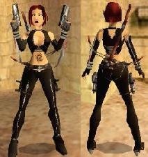
Bloodrayne Ver.1
by Devoid
by Devoid
Bloodrayne
I was actually thinking about doing BloodRayne's outfit, but I decided for one reason or another. I have to say that I'm impressed, but it's not quite perfect [nothing's perfect though]. The originality and quality are amazing! The textures were very good, but in strpix, quite a few of them were way too big. It's wouldn't have made a difference at all if the were scaled down a little. The meshes were ace and a score of ten on those is quite a compliment. One thing that I would like to say to the author is to stray away from paperthin hair. Making it thicker gives it more volume. The only downside of the outfit is its usability. It doesn't quite fit in with the Tomb Raider vibe and being she's a vampire, I wouldn't be suprised if it wouldn't get used. It's a pitty though, cause I completly enjoyed this outfit and I'll be adding it to my archives of favorite outfits. [i]Edited by TR_Nut[/i]
(22 Jul 2004 04:22)
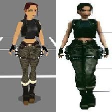
Tomb Raider Angel of Darkness Stealth
by MrNiceGuy
by MrNiceGuy
Tomb Raider Angel of Darkness Stealth
The originality is down a little because it's an AoD outfit, but it has a lot to offer. The quality is excellent and so are the textures. I didn't care a whole lot for the headmesh cause it just looks a little weird [I think it's something with the nose]. All in all, I recommend downloading this outfit if you want an AoD outfit. [i]Edited by TR_Nut[/i]
(20 Jul 2004 22:03)
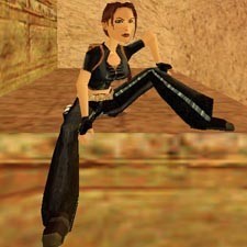
Lara's Own Style
by deskj
by deskj
Lara's Own Style
Other than changing the belt texture and the headmesh, it's the same as the the previous outfit, bringing the originality down a bit. I thought the headmesh was very nice, and it looked similar to the AoD one.
(20 Jul 2004 05:17)

Lara's Real Style [in leather suit]
by deskj
by deskj
Lara's Real Style
My first thoughts on this outfit were, it's nicely created, but it doens't wow me. It just looked the same as deskj's others. I'm not saying it isn't a good outfit, but I am saying that the idea seems to be overused a bit. The meshes were good, but I've seen the flare pants so many times they lost some originality. They textures were mostly ones from TR3, but they were nicely applied.
(20 Jul 2004 05:12)
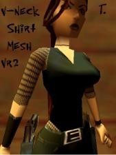
V-Neck Shirt Mesh
by Trinity
by Trinity
V-Neck Shirt Mesh
From the distance, the front of this mesh looks beautiful. I liked how smooth the overall mesh looked. However, when I looked closely at the 'V' I noticed several holes that would look bad in game. It looked as though the knife tool was used, because of the way it looked. Also, the back of the mesh suffered a little cause the v neck was never finished. If Trinity cleaned up this mesh a little, it would look a lot better.
(20 Jul 2004 04:22)

Zopf-Lara
by Picasso
by Picasso
Zopf-Lara
Lara with a ponytail. The idea has been used so many times, it's lost a lot of originality. This headmesh can actualy be created in 2 minutes, including loading and saving times making the newly created meshes not that amazing at all.
(15 Jul 2004 20:06)

Foot Meshes with Toes
by deskj
by deskj
Foot Meshes with Toes
Again, the arch is missing, but in these meshes, toes are added. While it gets an extra point in originality, it also looses a point in quality, cause it doesn't quite meet my standards of what they should look like. Try drawing feet several times over to get used to their design.
(15 Jul 2004 19:54)

Foot meshes
by deskj
by deskj
Foot meshes
There were a lot of poly's in the mesh, but the first thing that I looked for, I didn't see, the arch of the foot. Also, the overall design of the foot seemed off. Try looking at several different pictures of feet and compare them to the meshes. You'll notice that a lot of the curves are missing.
(15 Jul 2004 19:48)

Chest-Mesh
by Picasso
by Picasso
Chest-Mesh
The breast reduction doesn't look good at all. It would work well for a mutated animal, but definatly not for Lara. The sharp angles made it seem even more like it wasn't ment to be human. There was a missing poly which isn't too noticable in game, but it stands out in meta too much for me.
(15 Jul 2004 19:37)

Hipphopper Lara
by Picasso
by Picasso
Hipphopper Lara
One thing you want to ask yourself before posting a mesh is, "How the downloader will interperate this mesh?" Unfortunatly I had a hard time destiguishing what was the hair and what was the hat... even if there was a hat. If there was a hat, the author needed to seperate it from the hair. A simple "extrude" in meta would have done a whole lot for this head. What I interpreted as the hair, seemed a little paper thin. Of course hair isn't that thick, but in the game world, a little thickness is needed to make it look better.
(15 Jul 2004 19:14)

Edel-Mesh
by Picasso
by Picasso
Edel-Mesh
Some of the polygons on this mesh were a little pointless. The 'ball' on the back of her head could have been reduced in polys as the ones that face her head are not used and will be a little more difficult to texture. The drooping bit of hair looked a little strange and with a little more work it could have looked better. The originality was really good, as was the useability.
(15 Jul 2004 19:05)
Showing 1 to 15 of 160 reviews