
This is a Beta version of trsearch.org, more info in What's New page. Did you found a problem? Please report to info@trsearch.org
MrNiceGuy
Interests: None. Okay, a few. Alright, lots of them!
Gender: m
Items
23
23
Reviews
136
136
Follower
0
0
Showing 16 to 30 of 136 reviews
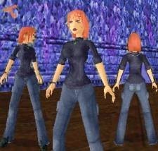
Irish Autum
by Trinity
by Trinity
Nice try, but too many bugs and disappearing polygons...
This is a very interesting outfit, because of the many things to look at. For example, there are the disappearing polygons. TRLE was designed so that polygons not in the camera's view will disappear to lower processor use. However, this was designed with "old" Lara in mind, not our big-shot detail outfits. When polygons are at a certain angle relative to the camera, they disappear. Around the pockets and hips this is a major problem. And then there are the missing connections on the torso and lower legs, creating some nicely messed up lightning here and there, and weak joining between the meshes. Not to forget the hole in the head (where the neck connects, easy to spot underwater), double faces at pelvis, broken right knee joint and holes underneath the pants (easily spotted when crawling)... No, this just won't do. Originality: 10 Jeans are well used, but combining them with a blue sweater and red hair is totally original, so I'll give you the full ten! Quality: 6 Taking all the serious bugs above in account, this is the worst part of the outfit. I've noticed that all of Trinity's latest outfits lack connections, and this is sad, because she's one of our most creative creators! Consider yourself lucky, 'cuz I'm going to write a tutorial about remapping next year, once I have time for it. I hope this will be of help for all the inspiring creators, as remapping is the most dreaded part of TRLE outfit creation. You'll have to settle with a mere 6... Useability: 9 It's hard to determine, as it's a totally new character, but she fits well into peaceful and casual level without shooting (she was designed as Young Lara, yes?). I'll give you a nine, since it's best for Young Lara levels only. Textures: 10 I really like those textures. True, the sweater is only one texture, but it's applied and rotated so well it's not a problem. The jeans are very well made, and the head's textures are just amazing, especially those gorgeous (3D) eyes! The hair is flaming red! The best part is; the textures only fill a single page! Well done! Full score here! Meshes: 9 Although they are very good, there are some small rants here as well. First of all, the bum sticks out quite a bit, making her figure a little out of balance. Many of the connections are placed on the normal meshes, and there are holes where the connections were supposed to join to. The single double face on the pelvis is hardly noticeable, but it's there. The ring and necklace are very good, although the watch looks a slight bit weird with a round shape and rectangular display. The head is well made, in particular the eyes and hair bits are really good, although there are so many of the latter! Maybe it would be a bit annoying for Autum's eyes? Anyway, since the meshes are mostly great, and the problems are few and small, I'll give you a 9! Overall Score: 8,8 / 10 I'll let you know when the tutorial is finished, as I hope it will be of help for you! Other than those problems mentioned, the texture and mesh work are superb, so keep those, and lose the bugs, and you might be on top, one day (if you aren't already...?)! UPDATE (in response to the comment): Whenever I review, I consider the following for each category: Originality: Simply how original the outfit/object is. If there are many look-a-likes, this gets rated lower. (Initial: 10, minus some points for the look-a-like outfits) Quality: The amount of bugs that affect the outfit's/object's overall look. The more serious the bug, the less it gets. (Initial: 10, minus points for each bug depending on their seriousness) Useability: How useful the outfit/object is [u]in the levels it's supposed to be used in[/u]. It gets a reting depending on how well it can be used where it's supposed to be used. (Initial: Depends on the overall outfit, no initial rating here) Custom Textures/Meshes/Animations: The quality (and size) of textures, meshes and animations count here. Too large textures, double faces, jerky animations and choppyness count against the rating (Initial: 0, get's better when the given category has been judged in Strpix/WADMerger/animation viewing program for TRLE and in-game. In-game is most important. Why I rated Quality 6: The problem with the outfit is that there ARE many bugs, and when taking their seriousness in count, this was my judgement: Disappearing polygons at pelvis: Serious. Having disappearing polygons is an annoying problem, especially in dark areas with light spots here and there (or when using a flare). It's possible to work around this problem by angling the faces so they're always visible from the troubling direction. But since even regular users could have spotted this after a few minutes, I gave it a deduct in Quality. Broken right knee joint: Moderately Serious. This is mostly a problem if the character is viewed from the front when playing, and that's rare. It can also be seen from the side though, so it counts against. Also, when the lightning is lower, and there's some light up ahead (or you're using a flare), you can spot a gap between the upper and lower leg, which is distracting and annoying. The problem usually occurs if you add the LARA object to the WAD after LARA_SKIN_JOINTS. Don't do this. Missing connectons: Barely Serious. Missing connections are mostly a problem when lightning affects the character, which is often, but it's not all that annoying. Since these were fine, it didn't count too much. Hole under head and pants: Serious. Having unused connection holes in the outfit when not using double matrixed connection betwen them is a BAD idea. If the outfit is used underwater or when crawling, the holes are revealed, and become annoying and distracting at once. If there are holes, you'll have to limit your level if you don't want the to get revealed, and that's stupid as well. Just patch up the holes, and the Qualiy increases at once. Double face at pelvis: Moderately Serious. When I tested, the texture was almost the same colour as the pants, but I still noticed it. If it suddenly gets another colour (not uncommon), it's very annoying. You were lucky though, as it's on the front, and therefore not all that serious. When there are so many bugs, it shows sloppyness, which must be avoided at all costs. There are so many things to remember, but that's a thing everybody must remember as well. Note on my last comment: When I said "Might be on top, one day", I meant the way people view your outfits. When I say: "Trinity!", people are going to think of high quality outfits and gorgeous textures and meshes (or The Matrix, if you wish)! That's how I view the expression: "Being on top"! [i]Edited by MrNiceGuy[/i]
(13 Dec 2004 22:38)
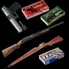
Resident Evil 4 Gunpack V.2.0
by Silent Viper
by Silent Viper
Sadly, not quite worth the effort...
As much as I like to see new weaponry on the SE, and totally new weaponry at that, there is much to remember when creating weapons. TRLE was never designed for other weapons than those included (obviously), so there is a whole lot of things to remember when creating weapons. Changing the meshes and textures are the main and easy parts, but you need different meshes for the hands (with/without lasersight), another one for the ground and inventory, and ammo for these. And all of them need to match the others to look okay. Then comes the problems. Either they look wrong in the inventory, or on the ground. For example the crossbow. It lies at a special angle on the ground, and few other weapons can lie that way (no pun intended) without it looking weird. If you correct your gun so it looks right on the ground, blam! It looks weird in the inventory. And then there are the issues with sizes, ammo and remapping, but I'll just skip those and get on with the categorical review... Originality: 9 This is a second version, although more of a follow-up, of the other RE4 Gun Pack by Silent Viper. They now have the original textures (or, as far as we know, at least), but still, they are quite alike, so I'll give you a nine, because of the new sniper rifle, new meshes and textures. Quality: 7 There are a lot of factors for the downrating of this category. First of all, the sizes. The pistol and sniper rifle are tini-tiny on the ground, but at a normal size in Lara's hands. The size of the shotgun is fine. The pistol has a really strange angle in the inventory, but the sniper rifle and shotgun are fine (except the centres are a bit off). Then there's the problem with hands. Since you can never know what hands the downloader is going to use, it's best to find a stereotype. I think a fully 3D hand like the one you used with the original 5-point joint connection will be most useable, although many people are using my old 4-point joints, which are a bit weaker than the 5-point, but still fine. Anyway, what I'm meaning is that, the verticles around the potential joint need to be remapped with the 0-1-2-3-4 vertex numbers (check Lara's hands in the tut1 wad). This is not so visible at the shotgun and sniper rifle, but very much on the pistol. The animations used for the pistol are great, but the sniper is a bit choppy and weird. I won't downrate on this though, since you didn't make them yourself. The shotgun uses the original animations, which is a handicap in this instance, when the gun has a long butt. Then, it sticks through Lara's back when she fires, and it's impossible to miss it... Also, when holstered, it goes in and out from her pelvis. My suggestion is to place it higher on Lara's back. That way it will still look fine, without sticking through the pelvis. Finally, the sniper rifle's lasersight doesn't sit properly on the gun in the inventory, but sits a bit inside it... That should cover the weapons. The ammo mostly floats a few inches over the ground and looks weird in the inventory, but it's really only a problem with the shotgun's ammo, which is a bit too large. But, it's not so important, so I'll let it pass. Useable: This is a bit hard to determine, as the pistol is modern, while the shotgun and sniper rifle are old fashioned. I'll give it a nine, since you can use them in both old and new levels! Textures: The real strength of the weapons! Okay size, and great quality! I'll give you full score on these, as they are the main feature of the pack! Meshes: Apart from the size, lasersight and angle issues, there's really just one more issue, that the hands on the shotgun and sniper rifle meshes stick into the weapon without holding it properly (the index-finger doesn't rest on the trigger, but sits inside the gun). But, apart from that, the meshes really make the weapons look like those from the beta videos of RE4, and I can safely say that it must have taken some time to get them right! I'll forget about the small quality problems, and give you a nine for the meshes! Overall rating: 8,8 / 10 Closing Comment: I really have just one thing to say: Make sure you test the weapons thoroughly before you consider them done. Rather have a weapon lying on a weird angle on the ground rather than the inventory, as the inventory will be with Lara all the time, but the ground weapon will be picked up and forgotten about quickly. UPDATE: Heh, your comment is longer than my review! :D You said a lot about what you think I rated wrong and downrated for, but I believe you exeggerated on many points, since I only downrate for the bigger points, and the smaller ones don't count much. Keep in mind that I'm not a weapon expert, but I reviewed like Average Joe (who can review properly) would have done, except, while I pointed out every single bug I found, I didn't downrate a lot for the sake of it. Picture me as the guy looking for weaponry to use in my TRLE level, and only to find a lot of bugs, I choose something else since the gun itself doesn't matter, as long as it's a sniper rifle, shotgun or pistol I can use. As for the animations, again, I only pointed out that they weren't the best, but I don't go downrating when they're not made by you. I could have done the same for the textures, but since you must have done a bit of editing to make them suit the weapons, I gave you a rating based on the final result, which, as you can tell, pleased me well. My closing comment is how I see it. There are many people using the inventory for changing weapons, and many using the number system. It's all individual, and I never downare for such things. The originality was downrated since I really thought the shotgun looked like the one from the other pack, also, the pistol had some similarities. They could be very different, but still, they appear to be improved over the last version, which I noticed, and gave a small lower because of. There was much new as well, so I kept it high. As for the useability, I rated as a whole, not as individual. I though that since the weapons came from the same game, they were supposed to be used together, and again, being the casual reviewer, I decided that even though they fit well together, their style was a bit different, so a small lower was in order. It's a matter of taste, and that what I think. The hands are the most difficult things to consider in the reviews. You must remember that I'm the bug detector of the site, and I usually notice every flaw a given outfit or object has. Being like this, I have to filter my rating from my comments, and only choose the points the average user could find, then base my review rating on those points. What you said about the hands is true, but you must remember that Tomb Raider is an adventure game, not only an action game. Lara spends most of her time climbing and exploring, and therefore the weapons are usually holstered. When she draws them, she does it to shoot something/someone, and after the fight, she holsters them again. The reason why I downrated on the hands in this review, is not because the index finger wasn't lying on the trigger, but because the hands was [u]inside[/u] the weapon. This must have been overlooked when placing them together, and therefore I gave a small downrating, but not much. I hope you didn't get offended by my weapon incompetence, but I really wanted to review the guns, and got a bit disappointed, but not totally. Reviewing an administrator's items can be hazardous, but I took my chances... [i]Edited by MrNiceGuy[/i]
(12 Dec 2004 02:36)

New water animation
by Piega
by Piega
Very smooth, but oily...?
I love water! The substance is one of the most wonderful things in this world. Swimming in water is like flying, except you can only hold your breath for so long. It's the essence of life, and it reflects light in a very beautiful way, making the surface very beautiful and magnificent! In reality, it looks like a moving mirror. In TRLE, it looks... well, not as good as it could have been. When I saw an improvement to the old, choppy water textures on the site, I immediately got an interest for them, and downloaded them very soon thereafter. Testing them was a joy in itself. Looking at them in sequence in Texture Edit showed a lot of smoothness, and they looked very nice overall. In-game they looked even better, moving in a very smooth constant sequence. They were simply amazing, but there is something not so good about them. The fact that they are blue and green instead of in greytones, make them look like oil when viewed at in-game. The thing many people haven't quite understood is that pure water is a transparent substance. Making the textures blue makes them fine for oceans, but for small water rooms it just doesn't work. But apart from that little note, these are much smoother than the original water textures, and are recommended for any ocean you're creating! To sum the review up, here's the categorical review: Originality: 10 We've had some sprite improvements by Silent Viper, including a water sprite, but those are a bit different than redoing the direct surface, so a ten for originality! Quality: 9 The textures animate smoothly and look like a water surface, so I'll give you the full ten here as well! Useability: 8 The fact that they are in blue and green limits their use, as water surfaces should be more affected by the colours of the areas above and below the surface. This can be fixed by making the textures in greytones, but for now, they are best used for oceans. I'll give you an eight here. Custom Textures: 9 As I've stated already, they are very smooth and well made, but since they are directly blue, their use is limited, so I'll give you a nine. Overall Score: 9.25 / 10 By the way, to make them look even better, give them level 2 Bump-mapping. This makes them look a bit more 3D.
(12 Dec 2004 00:22)
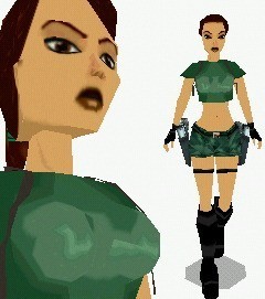
New Pacific outfit UPDATE
by Golden Dawn
by Golden Dawn
Better than tr463 and Danilo says!
I think this is a very good outfit, and it even has some things that other outfits don't! Let's have a look! Originality: Granted, it's not this first South Pacific outfit, so it gets a lower originality. Quality: there are some points here. First, there are normal problems on Lara's head, pelvis and upper legs. They are not too obvious though. Second, the hands haven't been remapped, so when Lara draws her weapons, her joints attach to her head... It lacks the ponytail, but that won't affect the rating. Just remember that you can use Lara's TR4 ponytail on TR3 outfits if you remap the ponytail connection point so it matches the TR4 version. Useability: Works great not only in Pacific levels, but jungles, deserts, tombs and even hot days in the city! Textures: Now those could have been better. The shorts are made out of 1 textures, with an additional texture on the end of the shorts. The blouse id quite plain, and the gloves could have used a more detailed texture. But the gunbelt and boots are fine. Is it just me or does Lara's nose look like it's broken? Meshes: Pure excellence. The blouse! Look at that thing! It's 3D! And it looks downstraight amazing! It's like Lara doesn't want to show of her chest, just wear something nice and comfortable! The boots and pelvis look good too, but since you just edited some other meshes, they won't affect the rating much. And, is there anything to affect? The top is the main feature of the outfit! Overall: I wish this outfit would be discovered, it's truely a piece of good work and with a TR4 ponytail it could be a certain winner! Lara looks very casual and comfortable in this outfit, not action packed and ready to go for the kill!
(22 Sep 2004 19:13)
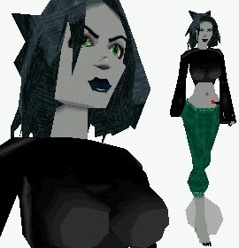
Werewolf
by Golden Dawn
by Golden Dawn
The real catwoman!
This outfit is just brilliant! Originality: It's the first playable werewolf I've ever seen in ANY game! Quality: No connection bugs or misplaced textures! Useability: For a werewolf level, this is an invaluable asset! Custom animations would have been good though, but no problem with that. Textures: This is the real set-back of the outfit. The shirt textures are very plain, and with the amount of skin shown, detail textures would have been good. The pants aren't plain, but repetitive. The hair textures are a bit strange, look like blue leather, it's for a dark effect, I guess. But the eyes and mouth are very good, I especially liked the long teeth in the mouth! Meshes: The two custom meshes, the torso and head, look great! The torso is symmetrical, and at a reasonable size. The head is very cool, with the pointy (and thin) ears, and the wild hair. The hair style really shows that this is a dangerous lil' lady! My thoughts: Testing this outfit was a joy, even when it has almost only old meshes. It really shows an idea put into action, and I like what I see! If the textures were improved on, and the meshes updated, this could look even better! But still, it looks fine the way it is now.
(22 Sep 2004 16:55)
Leon
by Trinity
by Trinity
Not good enough...
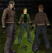
An attempt at creating a male character, but this could have been better... Originality: It's Leon Kennedy! He hasn't appeared in TRLE yet, and he hasn't even appeared in RE4 yet, only on beta pictures! So a max for originality! Quality: Ugh. A big factor to the lowering of this rating is the lack of skin joints. Of course, making custom skin joints is a daunting task, but the fake connections didn't work for me, and in some parts, like the right knee, the skin joint wasn't remapped correctly. The lack of double sided textures is really bad. This is especially noticeable on the foot - leg connection, where neither the joints appears, nor the pants have double-sided textures... Also, the right shoulder joint has one visible texture on it, which leads to seeing it joining to another mesh, in this case, the right leg. But a raise to the factor is the new skin joint, the elbow! Useability: To be true, he's a very strict character. He fights zombie monsters and tries to save the world, and this isn't the regular Tomb Raiding stuff, because though Lara saves the world, she does it in a very different manner. And with his warm outfit he fits better for night and city levels, but even there he doesn't appear to fit in... must be because he has his own agenda. Textures: They were great! The only set-back was the plain glove and shirt textures. Also, some other textures could have been improved on, but that's not a big deal in this outfit. I do think that the hair wasn't correct though, as Leon has fat hair, and this one appears to be clean... Meshes: Uh uh, sadly. A few faces overlapped eachother in some meshes, and many lacked two sides. The connections weren't good enough, so they looked jaggy and blocky in-game. Though the head mesh is a bit messed up, it's Strpix' fault, so no downrating there. But what was that transparent thing on the pelvis? Even if it's invisible in-game, it should have been removed instead. Other: The pistol animations weren't very good. I think the old guns would have worked better, but since you didn't make them, it won't affect the rating. Overall: Please update! I'm sure you can do it! Creating a male outfit is HARD, and I'm impressed that you even attempted! [i]Edited by MrNiceGuy[/i]
(22 Sep 2004 15:31)
P.N. 03
by Trinity
by Trinity
Hmm, this is a hard one...
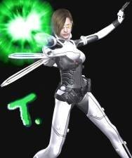
Ugh, this has got to be one of the most hard outfits to review! But, I'm up for a little heresy! Hmm, I'll take it section-wise... Originality: Ehh, it's Vanessa Schneider! Lara Croft's futuristic counterpart! And totally new! So that gets a max! Quality: You rushed yourself a bit here, Trinity. I found several bugs: First, both hands had a horrible connection to the arms, not only were they messed up, but the joints didn't match, and you forgot to remap the verticles near the connection points. To fix the problem, you should either use my hands with joints (deskj has used them in many outfits as well), or make your own. Second, the left elbox didn't have two matrixes (joint capability), so the arm was just floating in midair... and, finally, you removed many joints for no apparent reason, mainly on the torso. This is bad, as they serve an important role. Remember, the torso often needs remapping as well, just consult the original TR4 outfit for the correct numbers. And last, the "wings". Vanessa's arms go through them all the time when running, which is a shame. If they are bent a bit more backwards, this problem should be avoided. the wings tend to enter walls often, but it's hardly a problem since they're so small. Useability: For a futuristic Tomb Raider level... If you've played PN03, you should know that it's a bit like Tomb Raider when it comes to exploring and such. So, I think this gets a 9, I deducted one point since the outfit is so flashy it's a bit annoying to the eyes... but it's hardly a problem, though a lighter outfit wouldn't have been too bad. Textures: They're big! But still, the outfit only covers a single page worth of textures, so no problem there. Most textures are awesome, and they never seem wallpaperish or plain, so I'll give you a 10! Meshes: Hmm, it's a mix. The pelvis has a belt, though it's extremely thin and lacks double-sided faces, but the textures saves it. The legs are old fashioned, but get the job done. The torso... well, apart from the gigantic chest (it's body armour, right???), it was really cool! I don't like the way you joined the torso to the arms and head, but that's a quality issue, since the mesh is well made and without holes. Arms and hands weren't anything special, but work fine (except for the plentyful of bugs, of course). The head doesn't look all that much like Vanessa's, the hair colour and style is a different, and the shape a bit changed. But it's not a big problem, so it doesn't affect the rating much. Overall: Hmm, if it weren't for the bugs, this would have been the most excellent outfit. Still, the textures are great, and the meshes only need a small update, so I hope you will update it! Please? PRETTY please?? :):):)
(19 Sep 2004 17:52)
Munch: the scream
by Golden Dawn
by Golden Dawn
Lara has the Scream? Hmmm... so that's her dark secret!
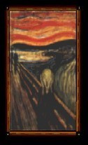
Wow! I'd never have guessed that someone would make this paining for TRLE! There's not even a question whether this object deserves a 10 in originality! And it's simply wonderful! Meshes and textures look so good, and they work perfectly together. The paining textures are a bit large, but when creating a real-life painting, you need LOTS of detail, so 128 x 128 is fine. Hmm, the visibility box is ok, but the collision is WAY out of range! Fortunately this can be fixed easily, but it's a bit sloppy, and reduces quality by one point. If you need a museum, this is a great addition, as real-life paintings make it seem more... real. I.e. if you wait 'till they catch the thieves and find the painting (can you believe it? They walk in at the middle of the day, draw their weapons, just take the "Scream" and the "Madonna", and escape in a car!? I mean, what's the matter with the security at the Munch Museum??? And also, how come they haven't caught the thieves yet? At least a hundred citizens and tourists must have seen the thieves! Well, living in Norway (not in Oslo though), this has been a lot in the papers and media, so I know what I'm talking about).
(12 Sep 2004 11:50)
Alias #4
by TR_Nut
by TR_Nut
ilovealias!!111!!1!
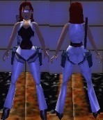
Wow, now this is one cool Alias outfit! Unlike the other ones, this has white shining instead of black! And glasses! And a jacket! And... Okay, I think I'll review section-wise! Originality: It's the fourth Alias outfit, but it's so different from the rest of them it's a 10! Quality: Quite good, but there are some misplaced (untextured) faces underneath the pelvis, and the knee joints stick out (but not too much). The outfit is also lacking hand joints, which becomes obvious when crawling and such. But otherwise it's awesome! And the holster-strap-hips are so cool! This pelvis shining still hasn't been fixed though, but with the white shining it's less noticeable. Useability: You're creating a futuristic level? This will make players play through the night! Textures: Though it's a single white texture, it's not plain, and the shining hides the repeatedly use. The lips and glasses look so cool, and makes it fit better into futuristic levels! Meshes: The pants look great, and the torso looks so stylish! The hands are missing joints, but look fine the way they are. The head is the best mesh of the outfit, and even though it's basicly the same mesh as in Alias #3, it has the glasses, which gives it a different appearance. Overall: If you're making a futuristic level, consider this a good outfit to use. With the shining and the cool head, it'll fit in almost all the time! Another Alias, another "All hail Alias!"
(10 Sep 2004 14:54)
Alias
by TR_Nut
by TR_Nut
The first short hair outfit!
Ahh, this is an instant classic! And it still looks awesome, even by todays standards. The originality is at a max. This was the first outfit ever to have short hair, and it took use of shining, and back then this kind of outfit was something totally new! The only custom mesh, the head, was plain amazing! Well shaped, good looking and most importantly well textured, this gets a 10 for meshes! Speaking of the textures, that's a double edged matter. On one hand, it has a cool hair texture, and darker boots, all well made, but on the other hand, there are many plain textures used here, and the bra looked a bit funny with the textures at the chest. Hmm, I think it's a 9, mainly because you used shining on the plain textures, so they aren't too noticeable, only cool! Now, the quality. Even the old Alias outfit has some flaws. First, the normal head is not affected by lightning, except some shadows and ambience. This is quite noticeable, but the scream head has working normals, so it's not too much of a problem. Then, there's the pelvis, which reflects the sky, since a custom SKY_SPRITES was not included. But I like the way you avoided the shiny joints problem by making the hip joints holster straps! So, I'll give it an 8 for quality. Last, the useability. Since this is an Alias outfit, it would fit into an Alias level, but not anywhere else. Even in an Alias level, it's a bit tough, because it's an undercover outfit that Sidney may use some times, but often not because of how visible she becomes wearing it... So, I guess I'll give it an 8 for useability. Overall, being the first ever outfit to feature short hair, and taking use of lots of shiny meshes, this is a classic, and probably was a breakthrough back when it was created, making people look further than Lara's normal outfits in their creations! So, all hail Alias!
(10 Sep 2004 14:28)
Lara with only one gun - revised
by Wizzkiddo
by Wizzkiddo
Finally a good one!
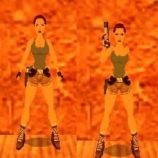
Wow! Finally a good one-pistol animation! I just wish this had arrived ages ago, but now it's finally here! What impressed me was the fact that it wasn't too messed up at the shooting part of the animation, I have tried to make an animation like this one myself, and I had too much trouble with Lara's arm jumping around like crazy when shooting... So congratulations on getting that right! The drawback to this item is that there are a few one-gun animations out already, bringing down the originality a tad bit. Also, it's a lot like the Revolver, but that's only a note and won't affect the rating, because it looks natural. The quality goes down a point because a texture of the hand (blocky too...) is rotated wrong, and it's very visible because of the new rotation of the hand, but I doubt people will use that pistol, rather an updated one, with the animation only. The inventory pistol appears a bit weird on the ground, and in the inventory. But the holsters are fine. Overall, this is the very best one-pistol animation there is, and I don't think it needs updating. Except if we could make one with Lara's other hand moving like before...
(05 Sep 2004 22:30)
New AOD jeans
by Danilo
by Danilo
This is pure quality!
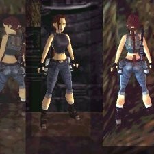
This is possibly one of the very best outfits on the SE. It's quality is simply amazing. Me, as the bug detector, could not locate a single bug on the outfit. Actually, I found some tiny mistakes on the meshes and textures, but these are so small they won't affect the rating at all. First, the meshes. Danilo has his own style in his creations, and it's certainly not a bad one. He's not overly detailed on simple meshes like the legs, but when you take a look at meshes like the head you can see a truly detailed style, with the usual stuff, like 3D lips and bits of hair coming down, but Danilo has gone one step further and made the bottom of the hair hang a bit lower, like in TR1, giving it a more classic look, but at the same time he used an EXTREMELY tight ponytail, so you can't really tell if it's a casual or hard hairstyle... The torso has a good shaping, though it's not very interesting. But it get's the job done. The textures are probably the most original AoD textures yet. The jeans are not from AoD, but from The Sims, and this gives it a new style. However, it has some choppy colour-changes when going from the hip to the legs. Also, the first thing I noticed when testing the outfit was that the knee joints don't quite fit in... It's strange, but they don't quite fit with the upper and lower legs, the textures kind of jump from one texture to the other, but this is a minor problem and doesn't affect the rating. The top textures look so much like the AoD top, and the textures are really at their best here. I only found a single misplaced texture here, but the colour of it was so like the top's textures it was hardly noticeable. The hair texture is also very good, it looks a lot like real hair! The boots were simple, but the textures were applied so well it was no problem. The originality here is a bit hard to determine, it clarly has some AoD in it, but Danilo has made a lot of changes to it to make it more original. For the good variation, I'll give you a 9. The useability is great as both a casual outfit and an action outfit, but I think the jeans look very tight and uncomfortable, not something Lara would wear at a casual basis, but they are still very useable as an action outfit, and because they can be used in casual environments as well to a certain degree, I'll give you a 9. Overall... I've stated it already. This is possibly one of the very best outfits on the SE. Great work, Danilo!
(28 Aug 2004 00:07)
Better Sprites
by Silent Viper
by Silent Viper
Wow! Just one problem though...
Wow! And I say wow! Being the currect sprite hot-shot, I figured I had to check these out, the picture looked really promising! And this could have been the best sprites ever, if it weren't for the fact that... the sprites have been messed up somehow, the original sprites have got black stripes all over them, making them look glitchy in-game. This is a real setback, but thank goodness we can export the yummy new sprites and leave the horrible ones alone! So, let's look at the goodies themselves, individually! The water sprite: this is THE feature of this pack! These look amazingly realistic, and they work great on the surface, always look 100% authentic! But it has a minor glitch, a small area at the bottom with strange colours on it. This causes a white stripe to appear at one side of the sprite in-game, but since they are transparent, it's not much of a problem, besides, any person can apply black textures there instead to fix it. Best sprite in the pack. Shiny sprite: Ugh... This is a tough nut. The problem with this sprite is that, though it works great with smaller objects, on big objects it stretches and bends so much is looks horrible... I tested it on my Assasin's catsuit, and the results weren't very pleasing. Still, if you don't have large objects with shining on them in your level, this can be used, but overall I suggest you stick with the original shiny sprite. One more problem is that it appears in the LENS_FLARE, and has choppy edges there, but that's inevitable with special shiny sprites, so it won't affect the rating. The sun sprite: This is the second best sprite in the pack. I'm glad SV also noticed the original sprite 32 has choppy edges, and this new one looks very good, and improves the quality of the LENS_FLARE in any level! This one should be used without the shiny sprite from the same pack though, or else the shiny one will cover it, and you won't see the beauty of the colour changes in the sun sprite... Overall: This is 2/3 quality work, and I would recommend the sun and water sprite to anybody making a half-decent level or better. The sad ting about sprites is that they may be hard-coded to several objects, so if you change one you can count on another getting ruined. But the water and sun sprites are only used by one object/effect each, so these should be used! You've done a great job on these sprites, SV, and only the fact that many of the DEFAULT_SPRITES have got messed up in some way is the big set-back of this sprite pack. [i]Edited by MrNiceGuy[/i]
(27 Aug 2004 15:11)
Angel of Darkness
by -TRANGEL-
by -TRANGEL-
Hmm... lightning problem on right boob!
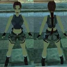
Well, it's another AoD outfit, and this means the lowest possible rating in originality, and frankly, this outfit hasn't got much new to it. The textures are okay, the front of the shorts look good, but the back is not so good, the pockets look a bit weird. The top is fair enough, but I find the textures a bit "jumpy", the colour change isn't very smooth, but because it's a dark top you won't notice it in-game. Boot textures are great, and the head looks true to the AoD model, though the hair isn't natural, it lies on a weird angle on the back of the head. You took my small glove texture (the one you used on the hand joints), but didn't credit me (again). The meshes are guite good, but there are a few issues there too. The worst one is the normal problem on Lara's right breast, you light a flare or stand next to a torch, and it screws up, literaly... The boot meshes, though they appear fine, are quite blocky, and so small Lara's feet wouldn't fit into them... I also found a small bug in the right knee joint, part of it disappears when Lara does anything else but standing still. The backpack is a bit too small as well, but that's really not much of an issue. Last, the fingers are the tiniest bit too short and thick, but that won't affect the rating. The head is awesome, only the ears are a little bit off, but again, it's only visible to the trained eye so it won't affect the rating. This all determines the quality rating, which I placed at an 8, but not lower since many of the bugs and mistakes are so small most people don't notice them. As a shorts outfit, it gets a top useability, since it can be used basicly anywhere. Overall, I think there are so many AoD outfits out there that only perfection is enough to make a good one these days. And with so many complete lines to choose from, I doubt people will use this if they need Lara to change into another AoD outfit in their game, but for single levels it may be used.
(21 Aug 2004 13:58)
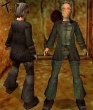
Eckhardt
by Trinity
by Trinity
Ehh? Old school teacher?
When I downloaded this, I was unsure what to expect... What I saw when looking at the outfit in StrPix was a very good outfit indeed, without plain textures and with many detailed meshes. It was amazing to see the resemblence to a male character in the outfit! However, when I tested it in-game I found a couple of bugs and unusualties... First, many of the meshes was lacking doublesided meshes, the worst examples being the bottom legs and the torso. When Eckhardt moves, you can clearly see an empty space in the connections there, and it's very annoying. Second thing I noticed was some bugs in the head, where the area around the mouth looks very messed up, and the glasses are totally transparent (don't use translucency on black textures, it makes them invisible!). Also, when Eckhardt screams, parts of the head becomes semi-transparent. I also found that the torso looks... feminine in the chest area, making Eckhardt look like an old female school-teacher! But that's really a minor problem, and with the bad stuff said, let's look at the good stuff! The textures are from AoD, and almost every texture is well imported and correctly assigned, the problems already mentioned. And no plain textures! The meshes are very detailed, and do a good job in holding the character together (though the torso's connection to the pelvis is very stiff)! I especially like the arm with the glove on the hand, with the bands around the wrist! Being Eckhardt, it's at a top in origiality! The useability is only at a mid-point, because though Eckhardt fits ito more places than you initially think, there are still a few places where he definetely not belongs, especially not Egyptian tombs! But overall, I say this is one fine piece of work, and though some areas of it requires some more work, it's really as good as it gets! Great job, Trinity!
(17 Aug 2004 13:36)
Showing 16 to 30 of 136 reviews